BRANDING
- My contribution
- Various
- Team
- 2× Product Designer, 1× Product Manager, 3× Engineers
- Year
- 2025
Make a Print on Demand branding stand off with a touch of Africa.
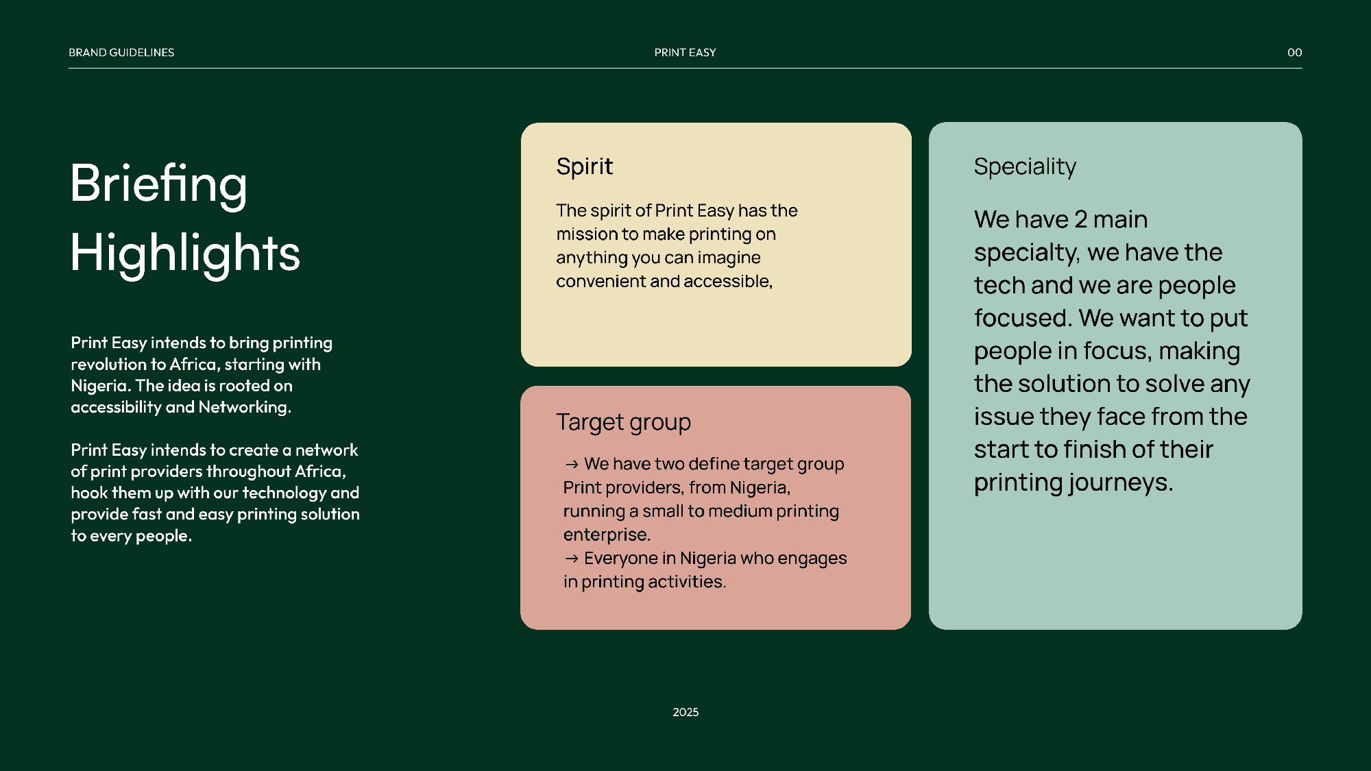
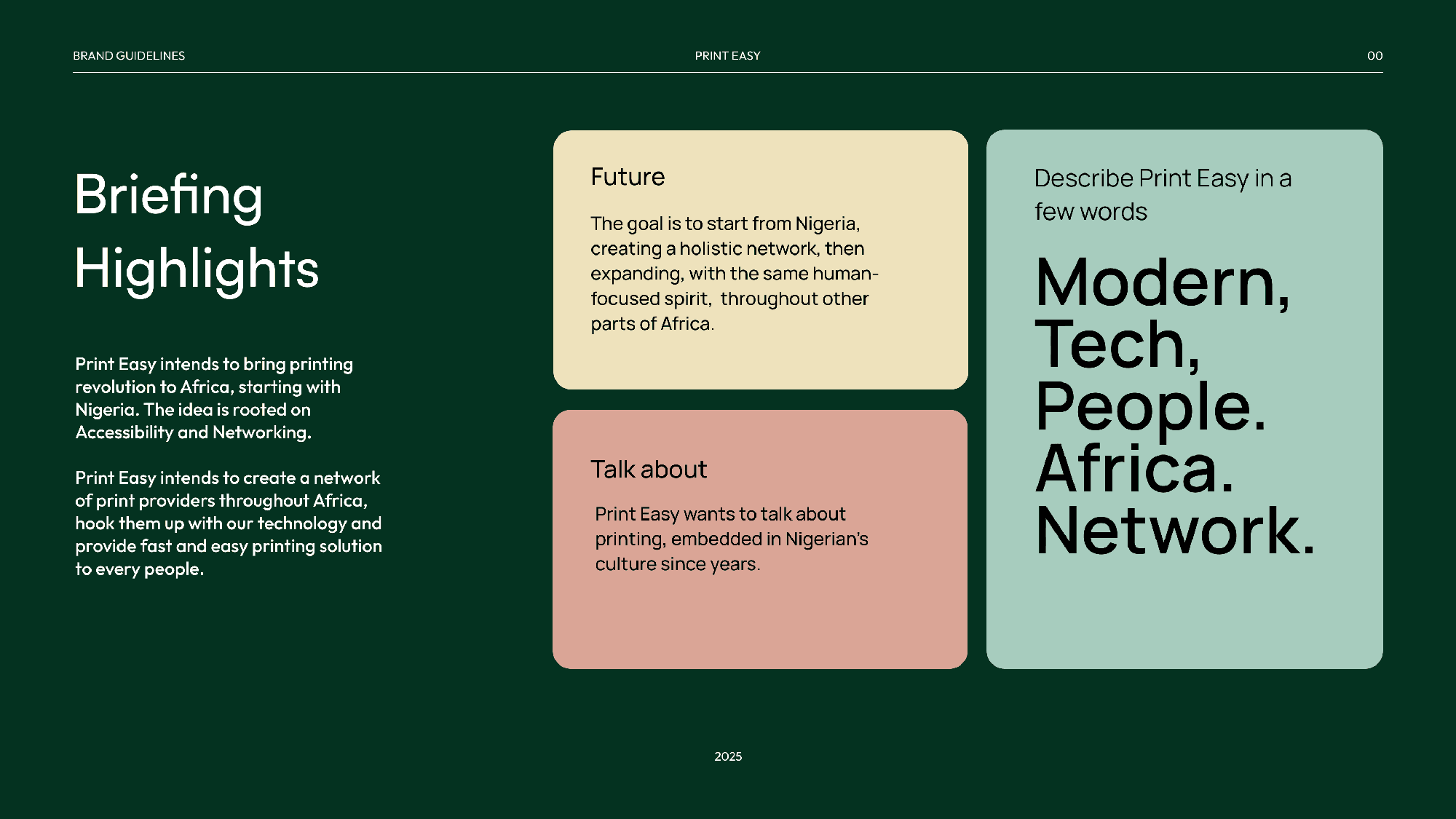
The goal of the PrintEasy brandbook was to establish a bold, culturally relevant, and future-ready visual identity for a printing tech platform built for Africa. As the head designer, I wanted to create a brand system that not only speaks to the functional power of print-on-demand technology but also celebrates the vibrant aesthetics and entrepreneurial spirit of African creators, particularly in regions like Nigeria where custom printing is on the rise. PrintEasy aims to bridge the gap between end-users; designers, influencers, small businesses, and printing suppliers across the continent. The brandbook needed to visually reflect this dynamic connection: between tradition and innovation, technology and creativity, culture and commerce.
Research Process
To ensure the brand identity was grounded in both purpose and place, I undertook intensive research. This included:
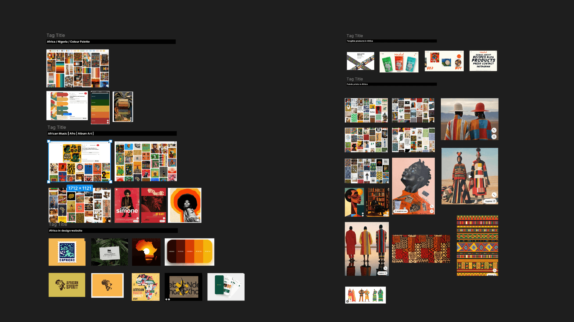
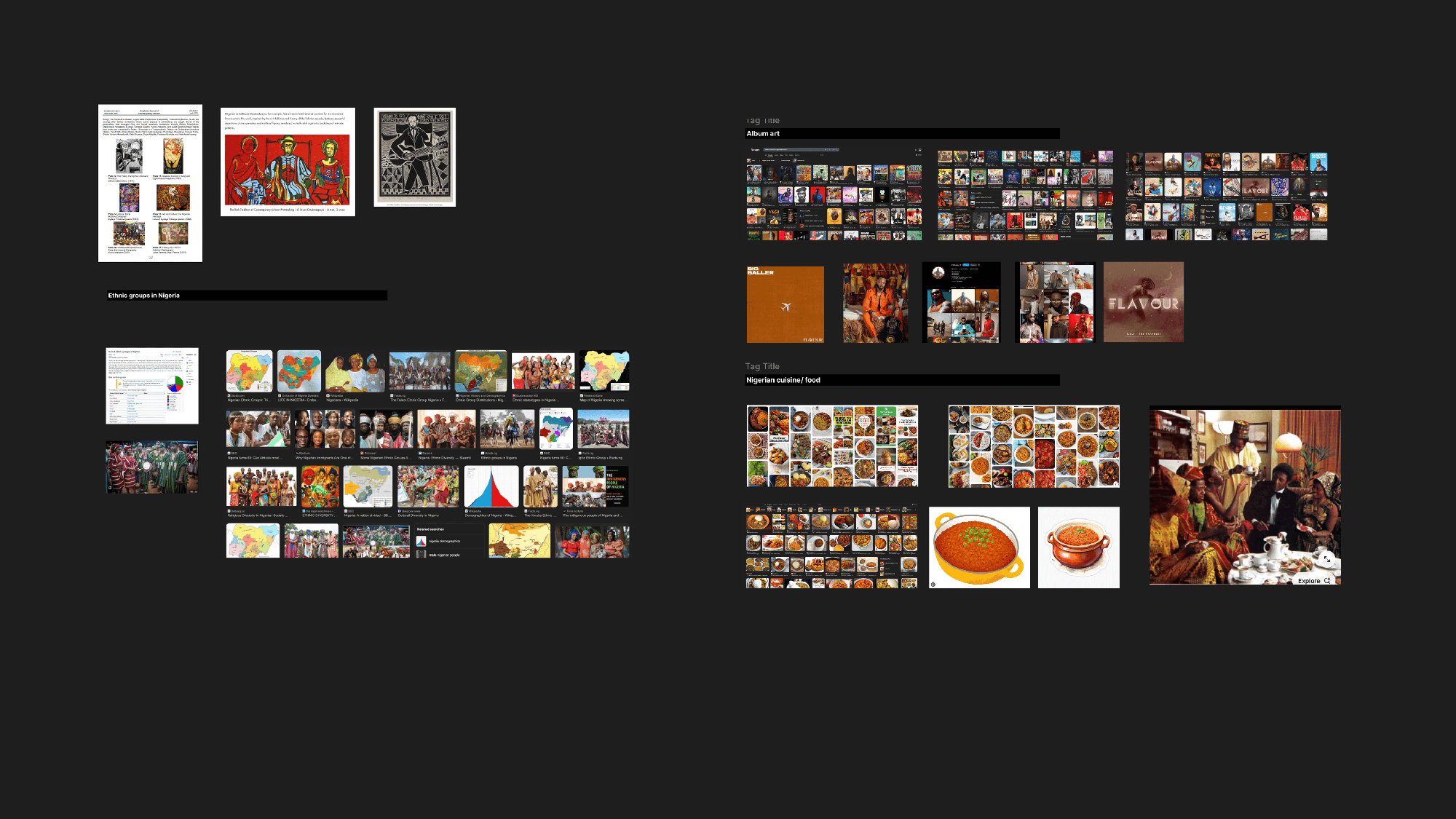
Visual Research: I collected hundreds of references;images, textures, fabric patterns, hand-drawn logos, street art, and symbols, from both global and local sources. I explored African textiles, streetwear brands, food packaging, and traditional crafts.
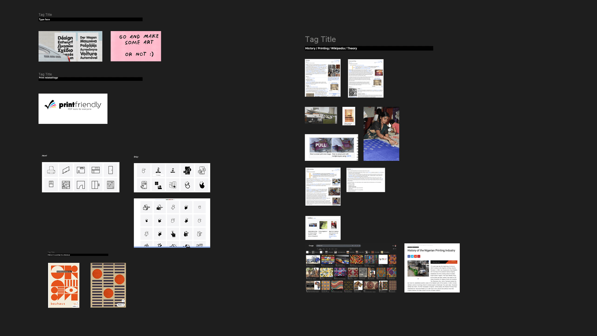
Cultural and Industry Insights: I studied the history of printing, from manual typesetting to digital print technologies, understanding the shift toward sustainability and speed. I explored the growth of print-on-demand in Africa, especially among young entrepreneurs selling t-shirts, hoodies, tote bags, and more.
Inspiration from African Creatives: I drew from the works of fashion designers, illustrators, and typographers across Nigeria, Ghana, Kenya, and South Africa who use bold, expressive visuals rooted in identity and heritage.
Language and Expression: I also looked into how brands communicate in the African digital space; tone, slang, humor, and directness; to shape our voice.
Logo
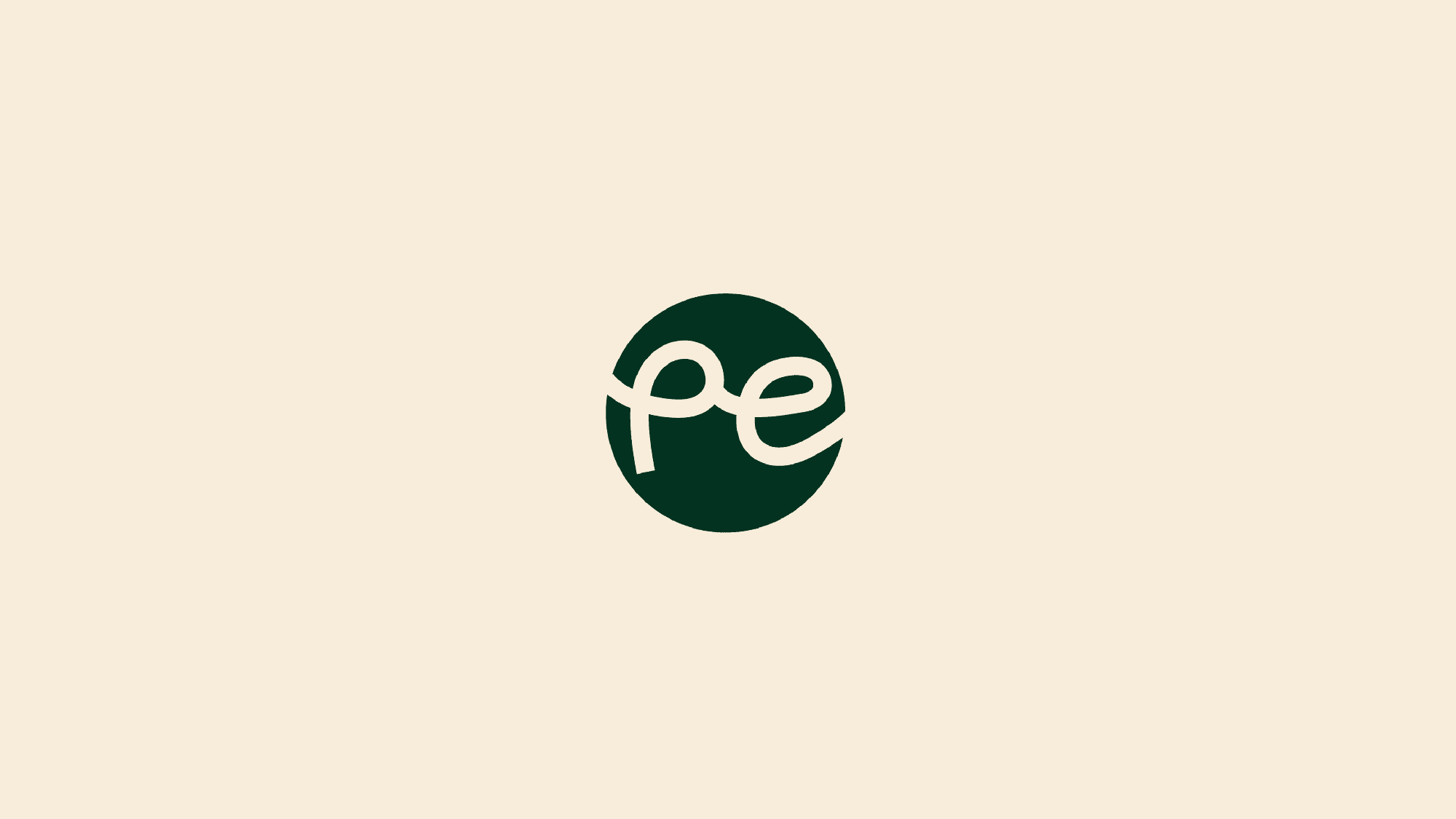
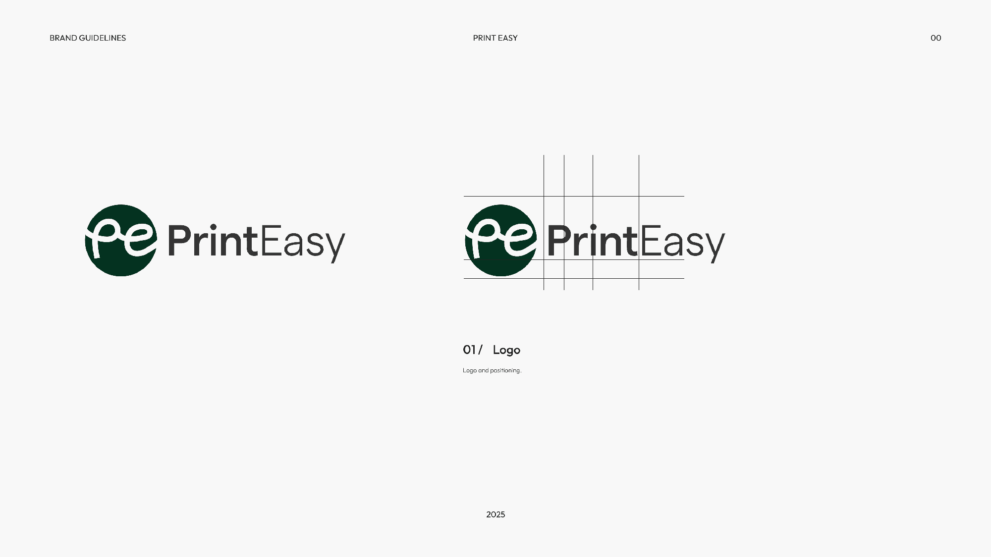
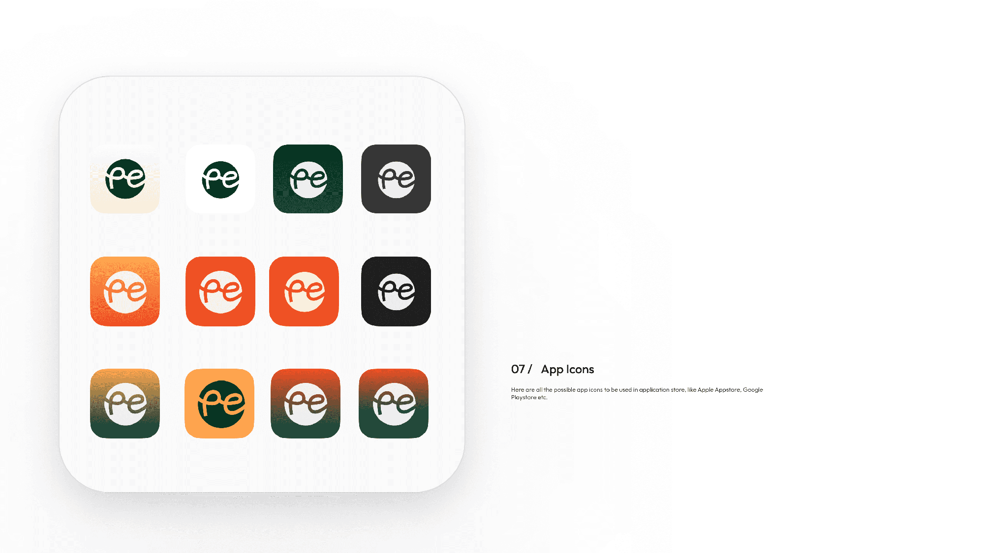
The PrintEasy logo is strong yet flexible. It captures the dual essence of tech-enabled printing and creative expression. Its geometry draws on stencil-like industrial forms while remaining clean and modern.
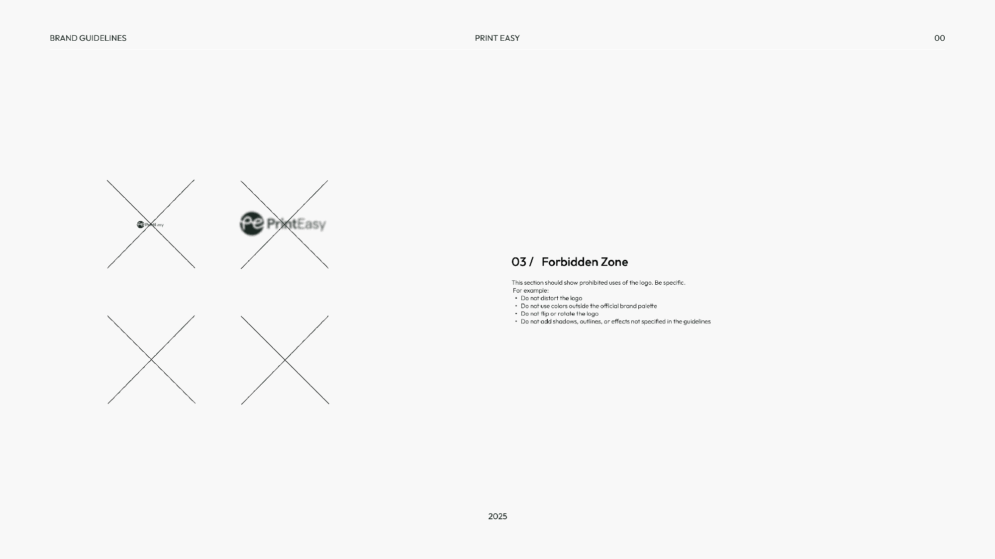
Safe Zones
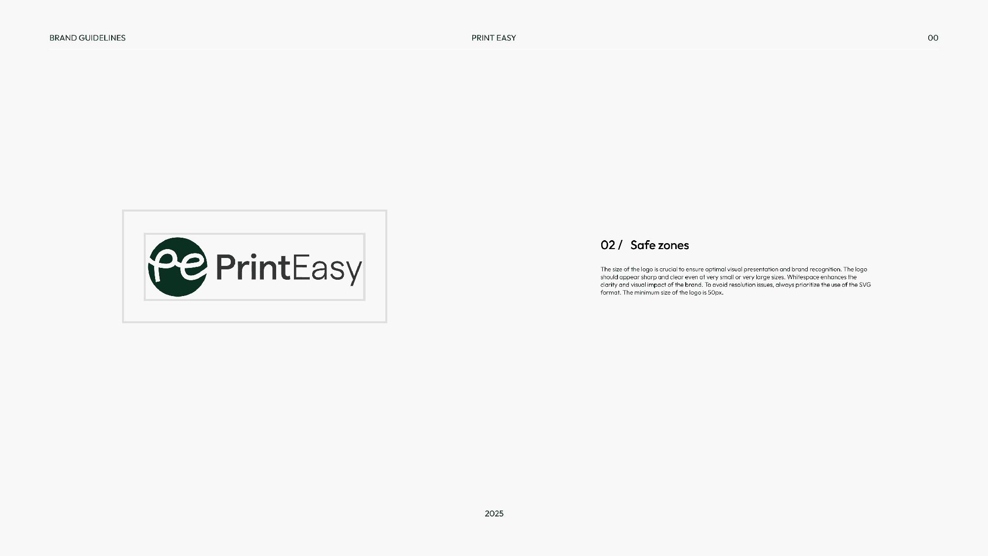
Clear space rules ensure legibility and consistency across formats,from mobile apps to storefronts.
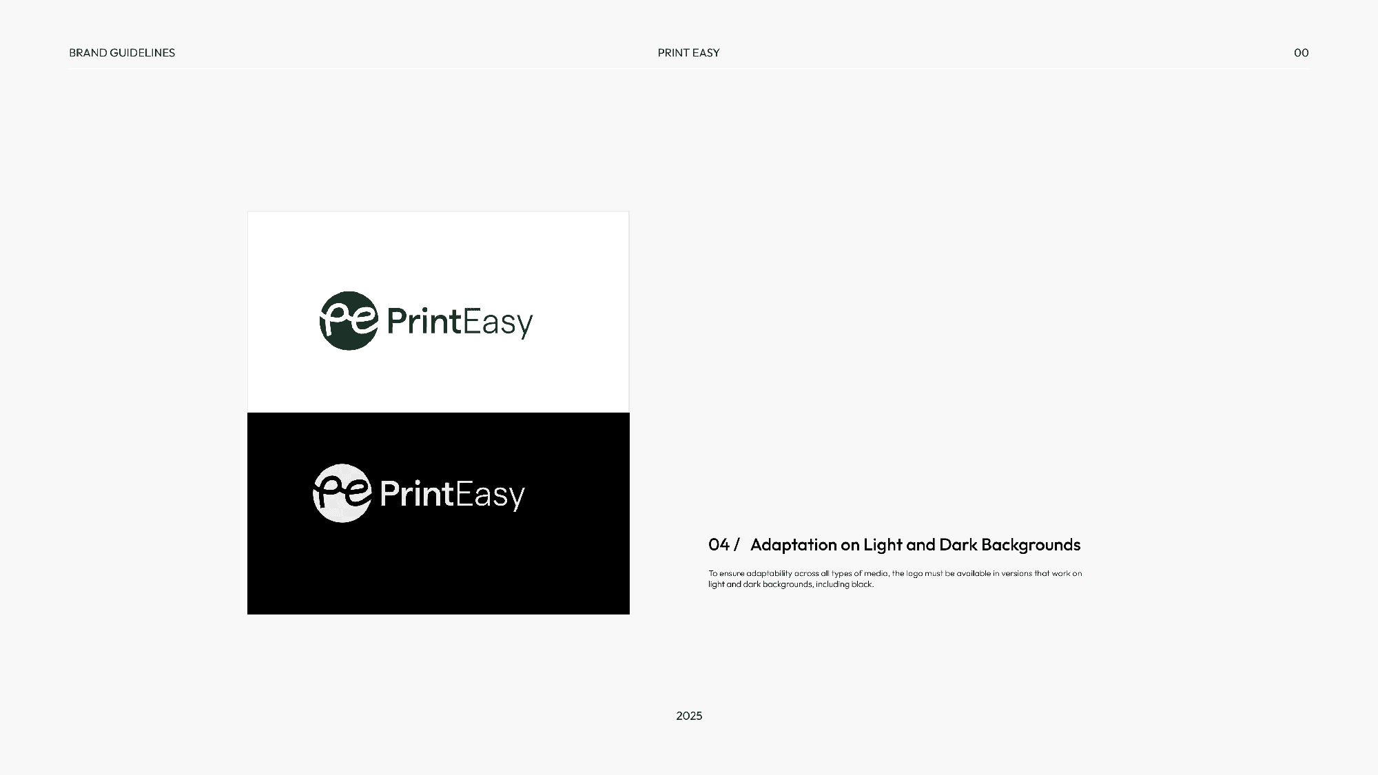
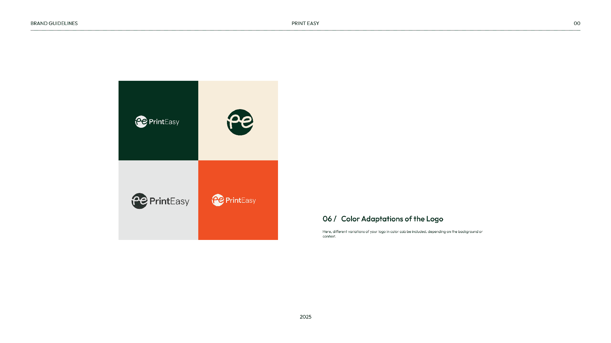
Adaptation (Light/Dark Backgrounds)
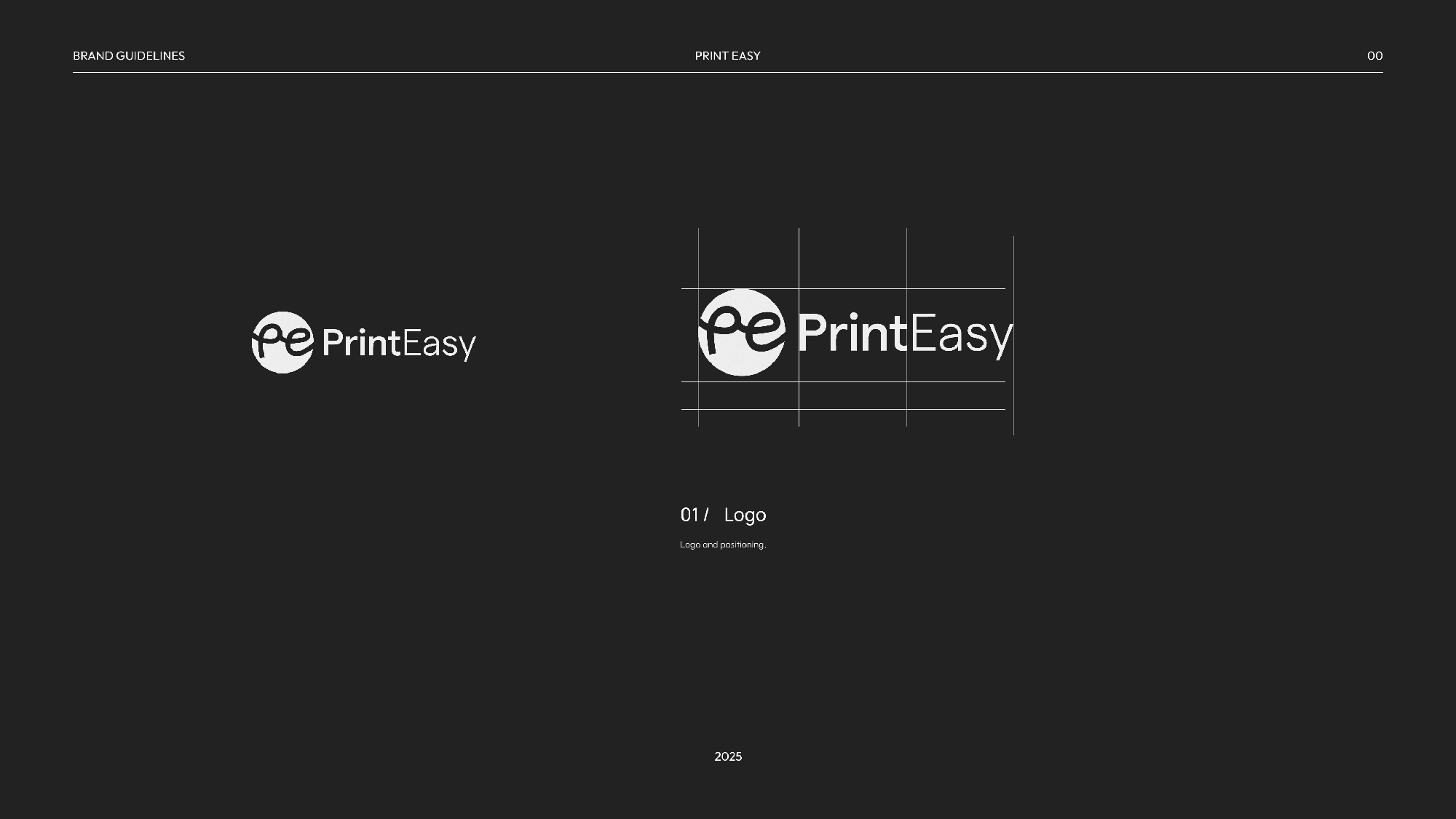
The logo adapts seamlessly across different background types. We explored how it works in full color, black and white, and reversed formats for digital and print use.
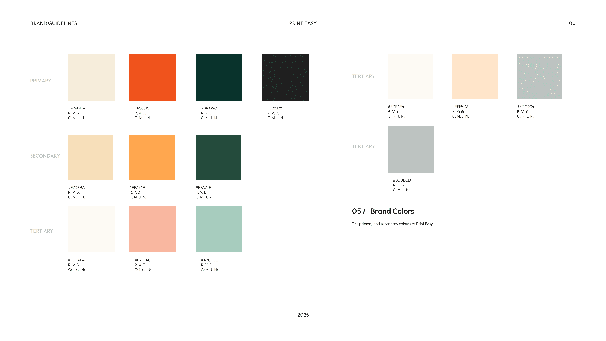
Colour Palette
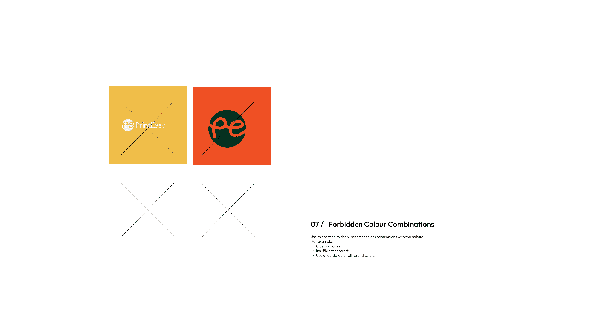
Inspired by African fabrics, urban spaces, and ink pigments, the palette includes bold, grounded colors like ochre, charcoal, rich green, and vibrant accents that evoke energy and craftsmanship.
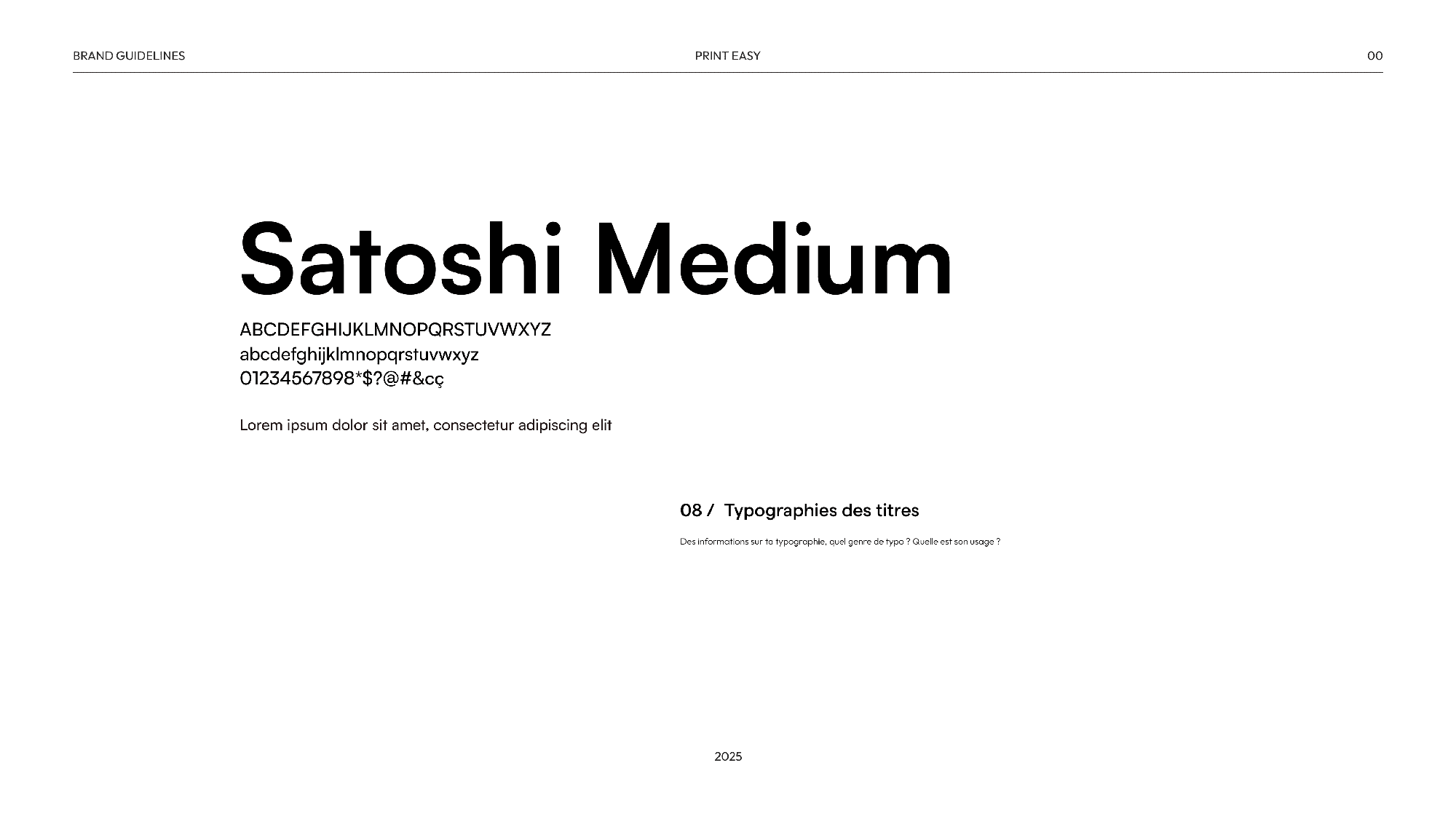
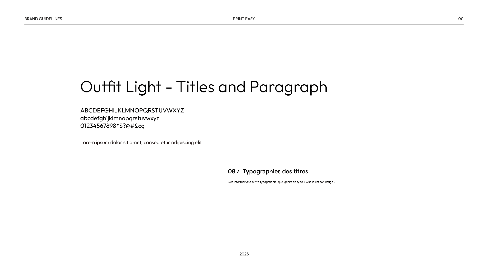
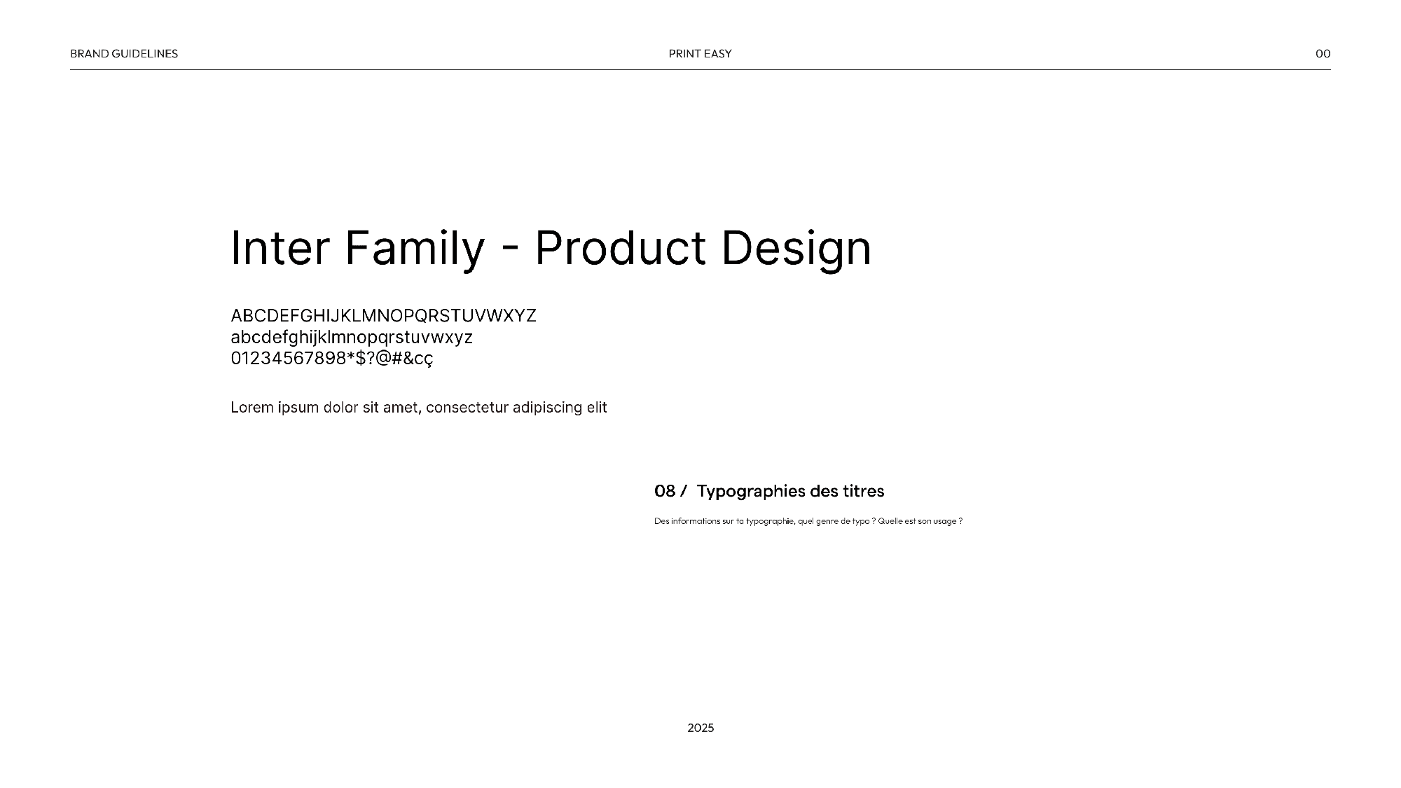
Fonts
A mix of industrial-inspired sans-serifs and handcrafted type forms reflect both the reliability of the platform and the creative individuality of its users. Type hierarchies were tested across real-world scenarios: product mockups, app interfaces, and posters.
Imagery
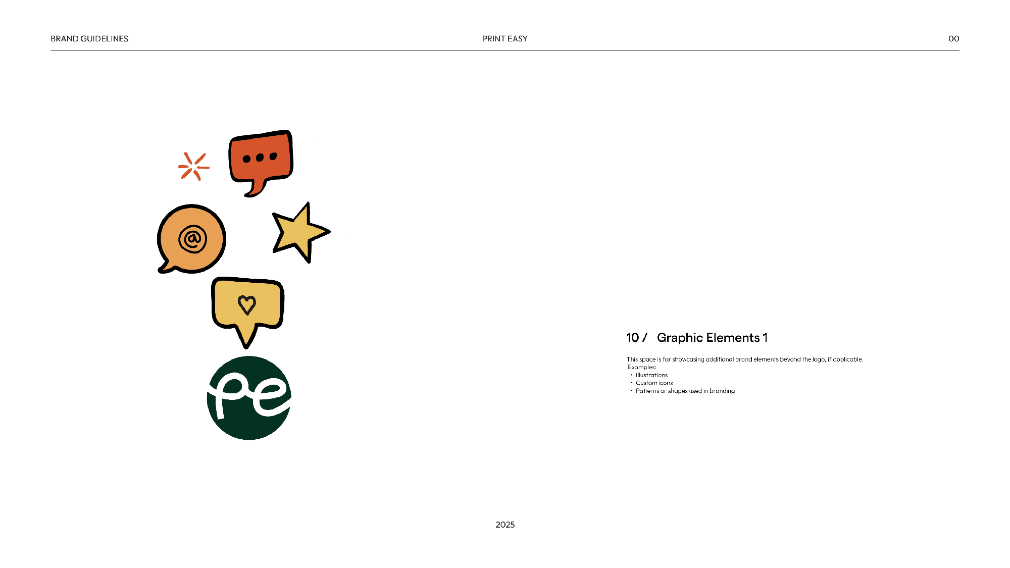
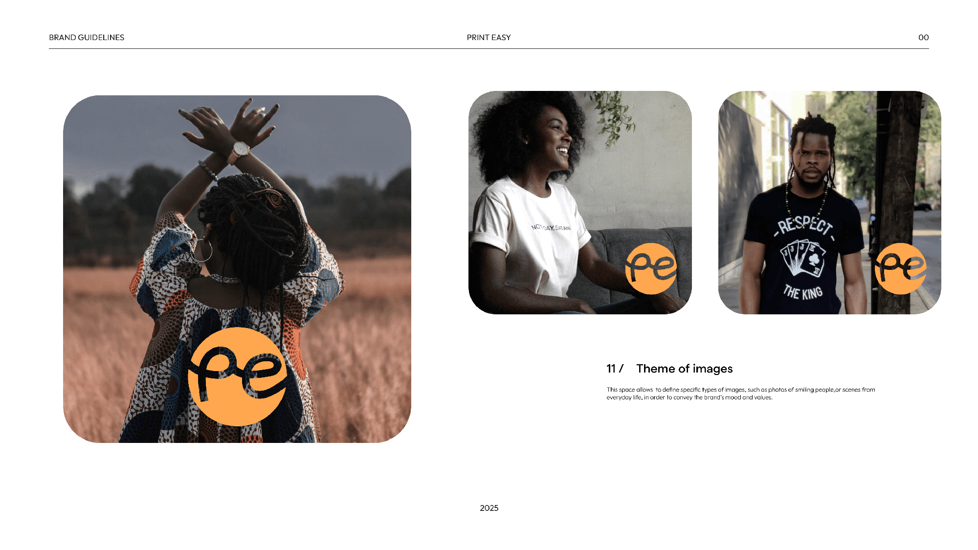
Photography and illustration guidelines highlight real makers, materials, and printed products (in the making). The imagery reflects diversity, pride in craftsmanship, and contextual relevance - African settings and everyday creativity.
Tone of Voice
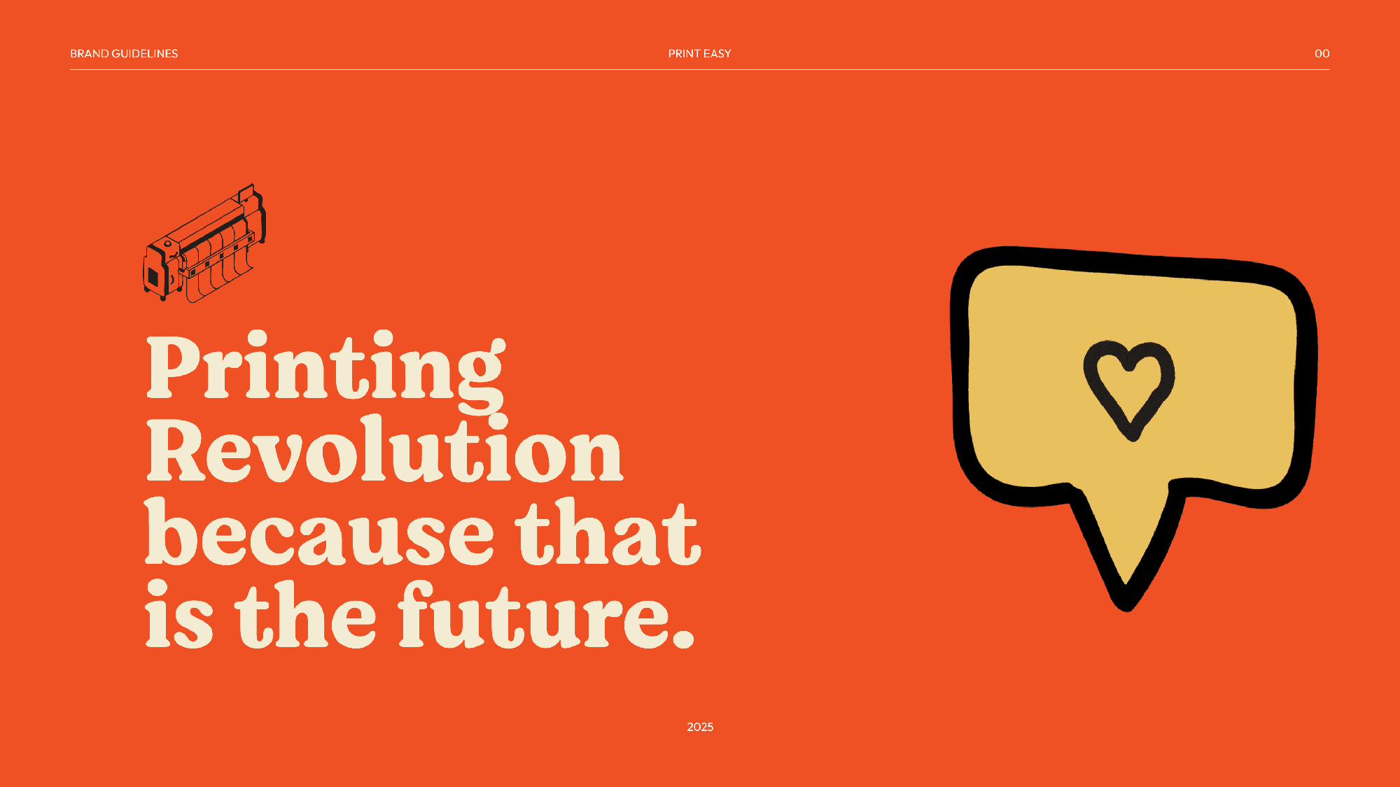
The voice of PrintEasy is direct, empowering, and community-driven. It reflects the tone of small business owners and creatives; practical but never boring. Messaging emphasises speed, reliability, and creativity, with room for cultural references, slang, and humor.