Seamless Onboarding
- My contribution
- UX Research User Testing Product Design
- Team
- 2× Product Designer, 1× Product Manager, 3× Engineers
- Year
- 2026
Redesigning the onboarding experience of an insurance and fintech app to simplify verification and help users get started with confidence.
A focused study on why the Insurtech 30-screens registration was failing, what the user interviews and PostHog funnel data proved, how a customer journey map revealed the emotional reality, and the design decisions that led to the v2.0 prototype.
Overview
Desk Research
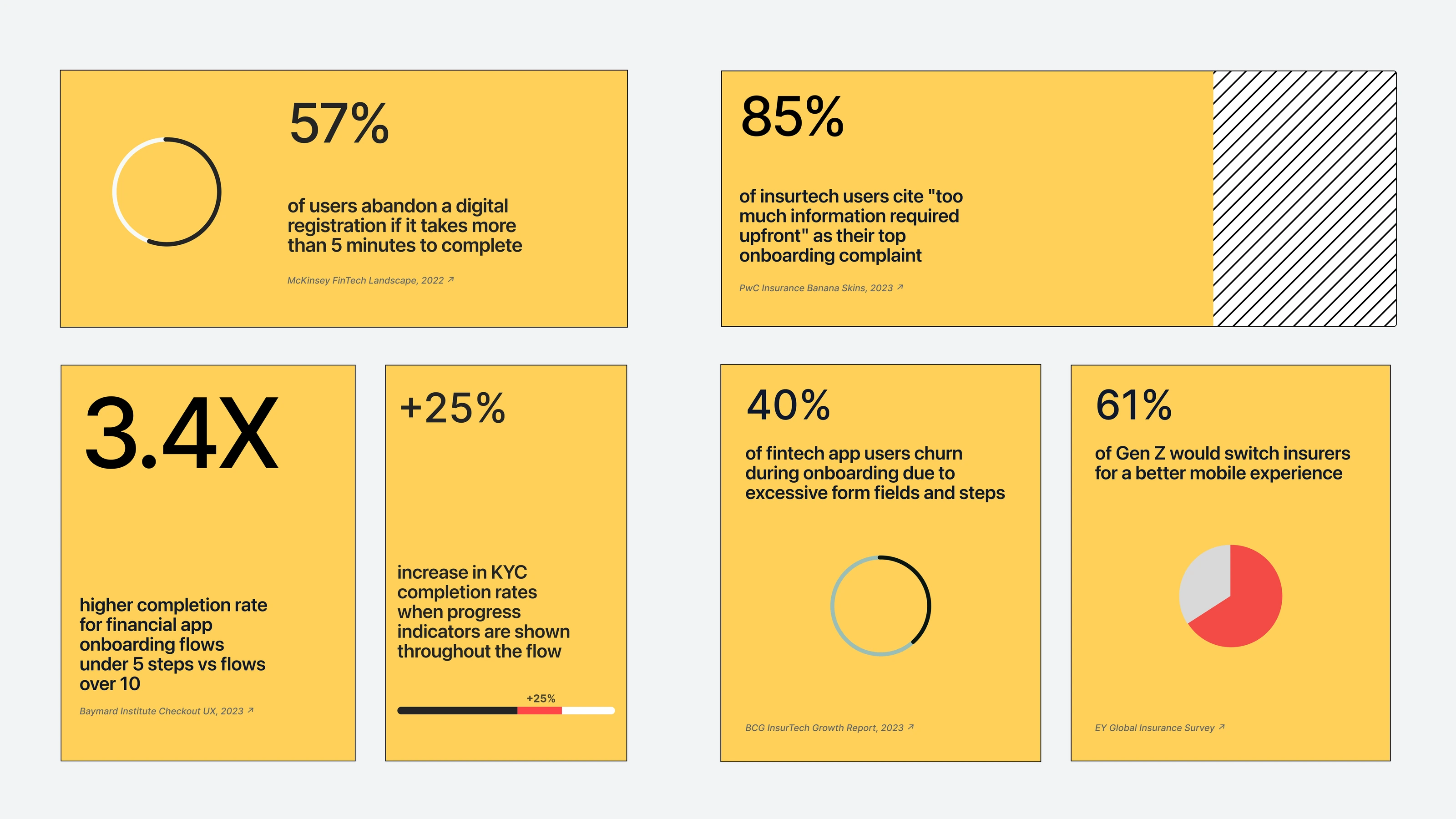
Before looking at Laferla’s own data, published research on onboarding in fintech and insurtech was reviewed. The pattern was consistent: the more steps and the more information asked upfront, the more people quit.
The evidence for shorter flows is overwhelming + and the cost of ignoring it is quantified.
Data from PostHog
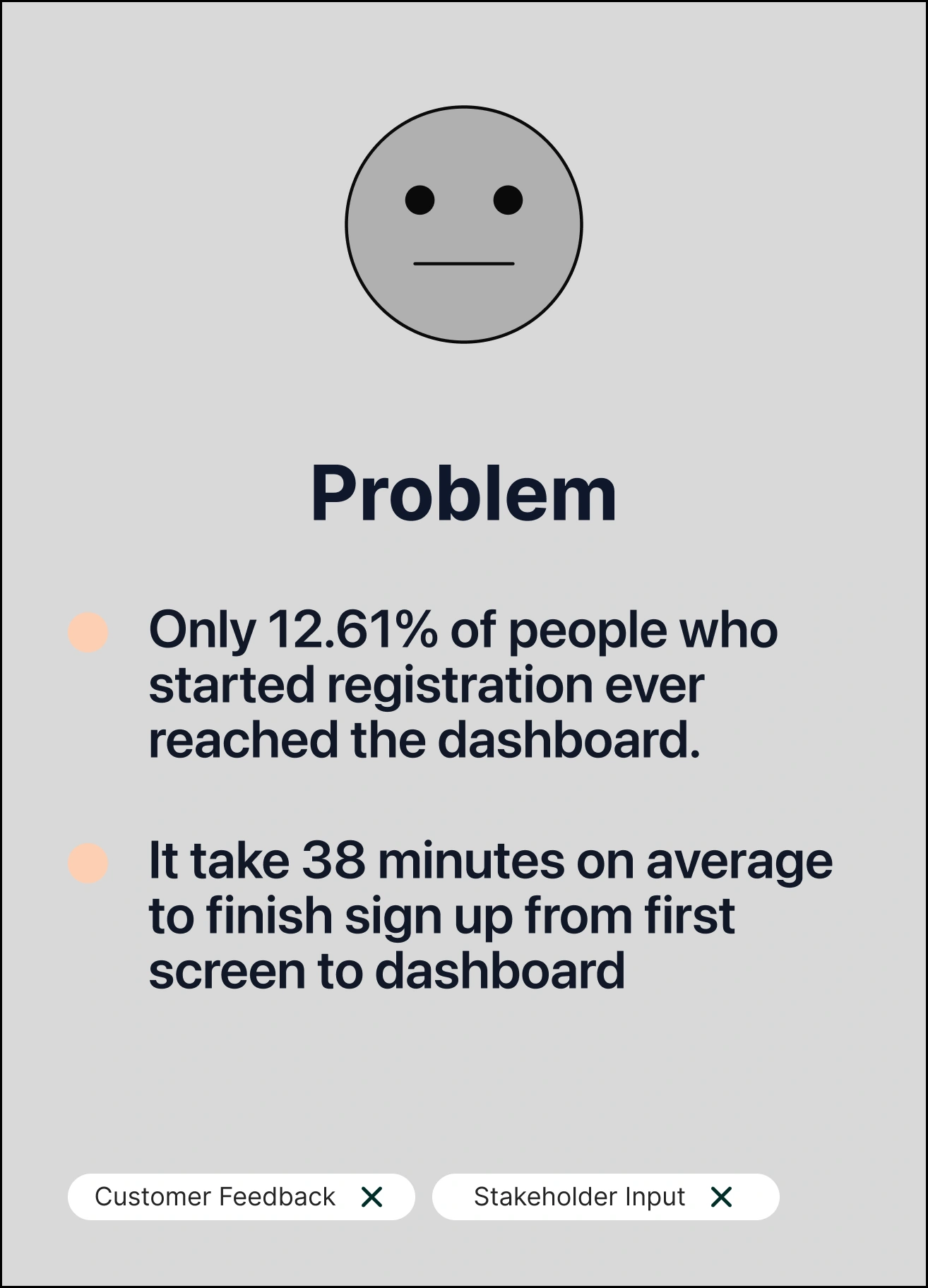
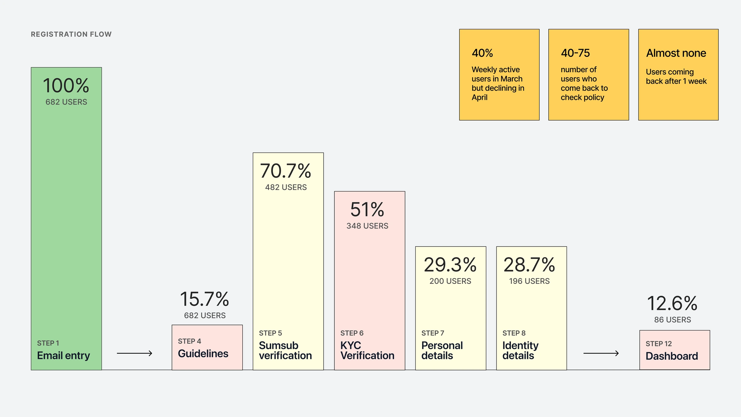
The full registration flow was pulled from PostHog. 682 people started. 86 reached the dashboard. The step-by-step view told more than the headline. 84% of people left at step 4. That suggested the flow wasn’t simply too long, but some specific screens were stopping people.
USER JOURNEY
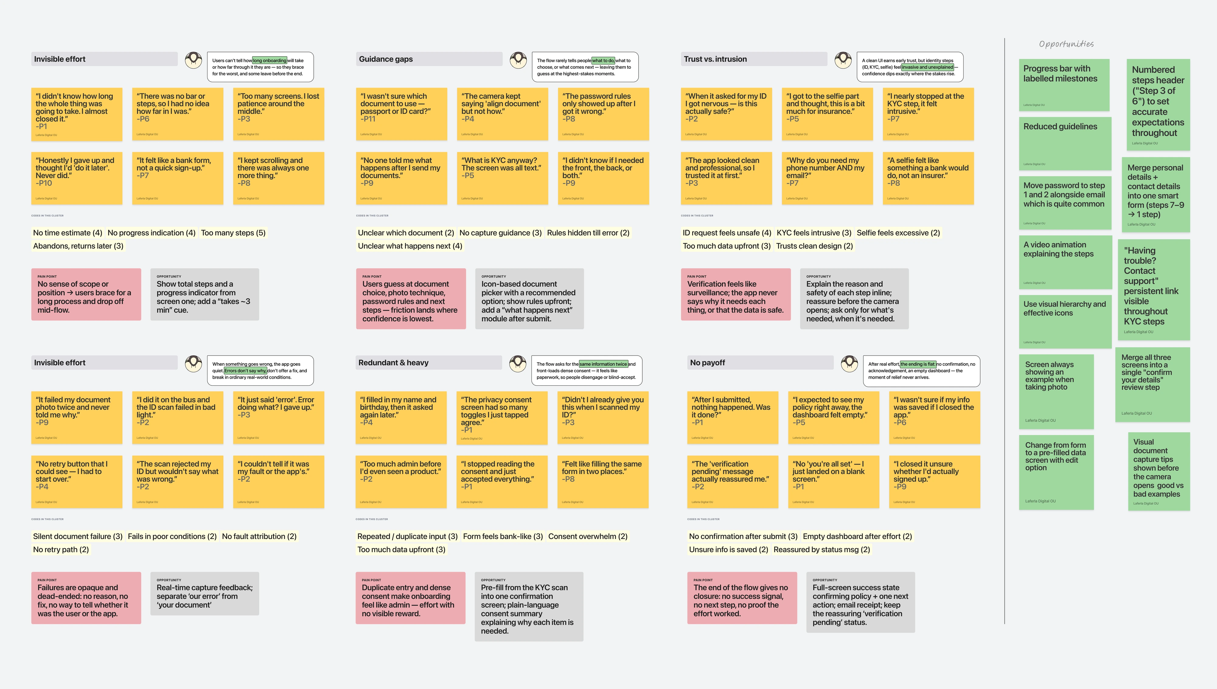
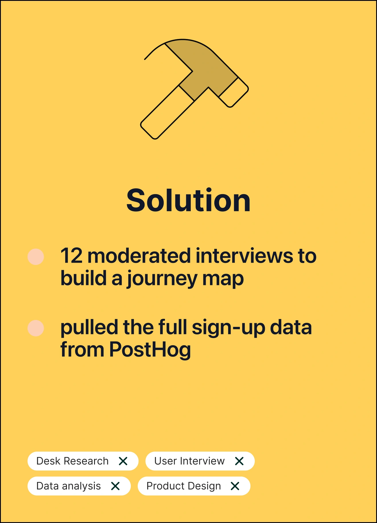
12 moderated interviews were run and mapped against the PostHog data, stage by stage, including how people felt at each point. Four patterns stood out.
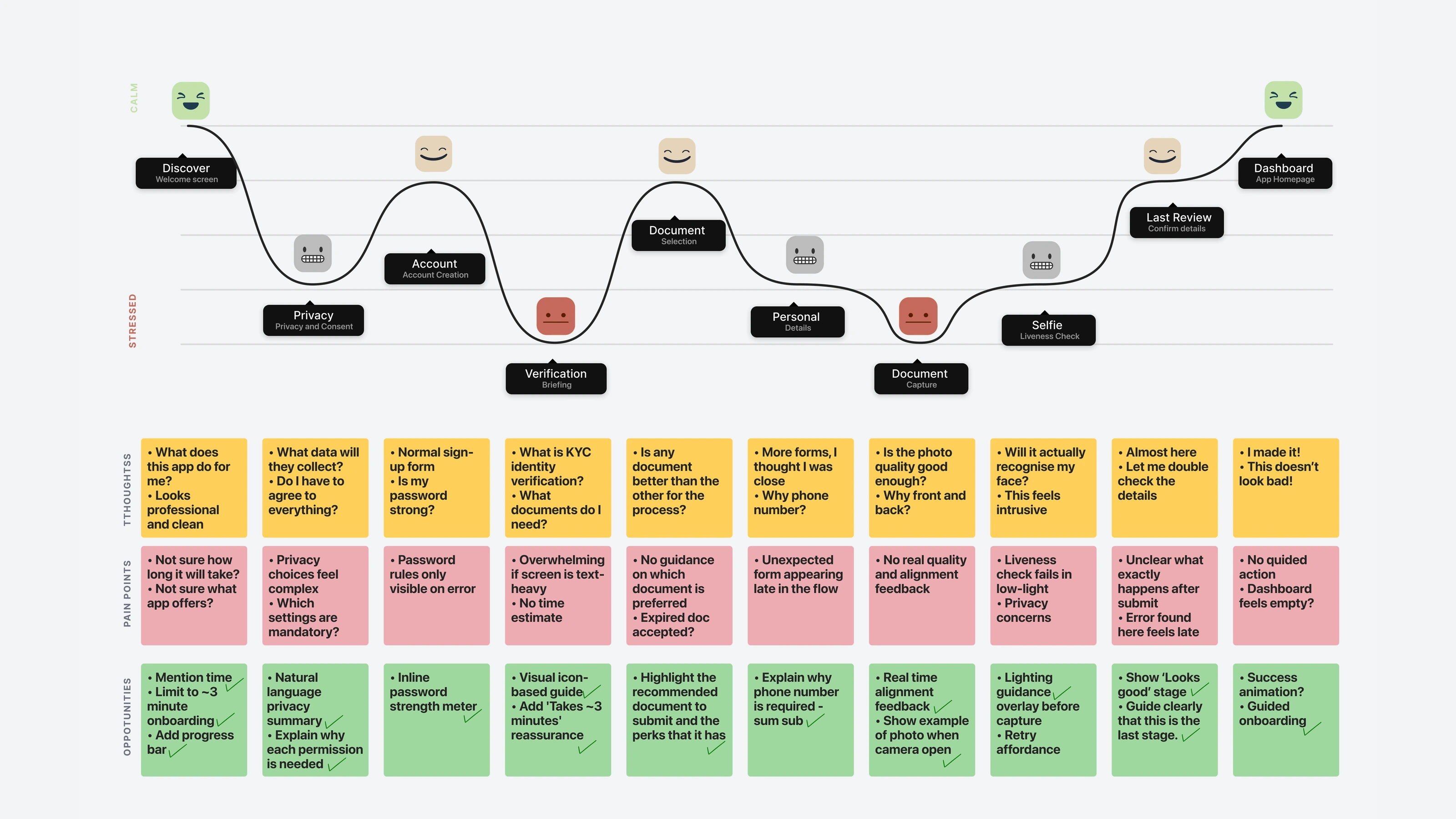
A. Step 4 felt like a threat, not a next step. The big drop probably wasn’t people rejecting the product. The screen seemed to put them on guard instead of moving them forward. B. The identity check felt risky. At steps 5 and 6 the worry seemed specific: doing something irreversible wrong, with no guidance and no way back. C. The flow asked for the same thing twice. Steps 7 to 9 asked for details the identity check appeared to have just collected. D. The order suited the system, not the person. Password creation sat at step 10, after identity verification. Most people expect email and password to come first.
DESIGN DECISIONS
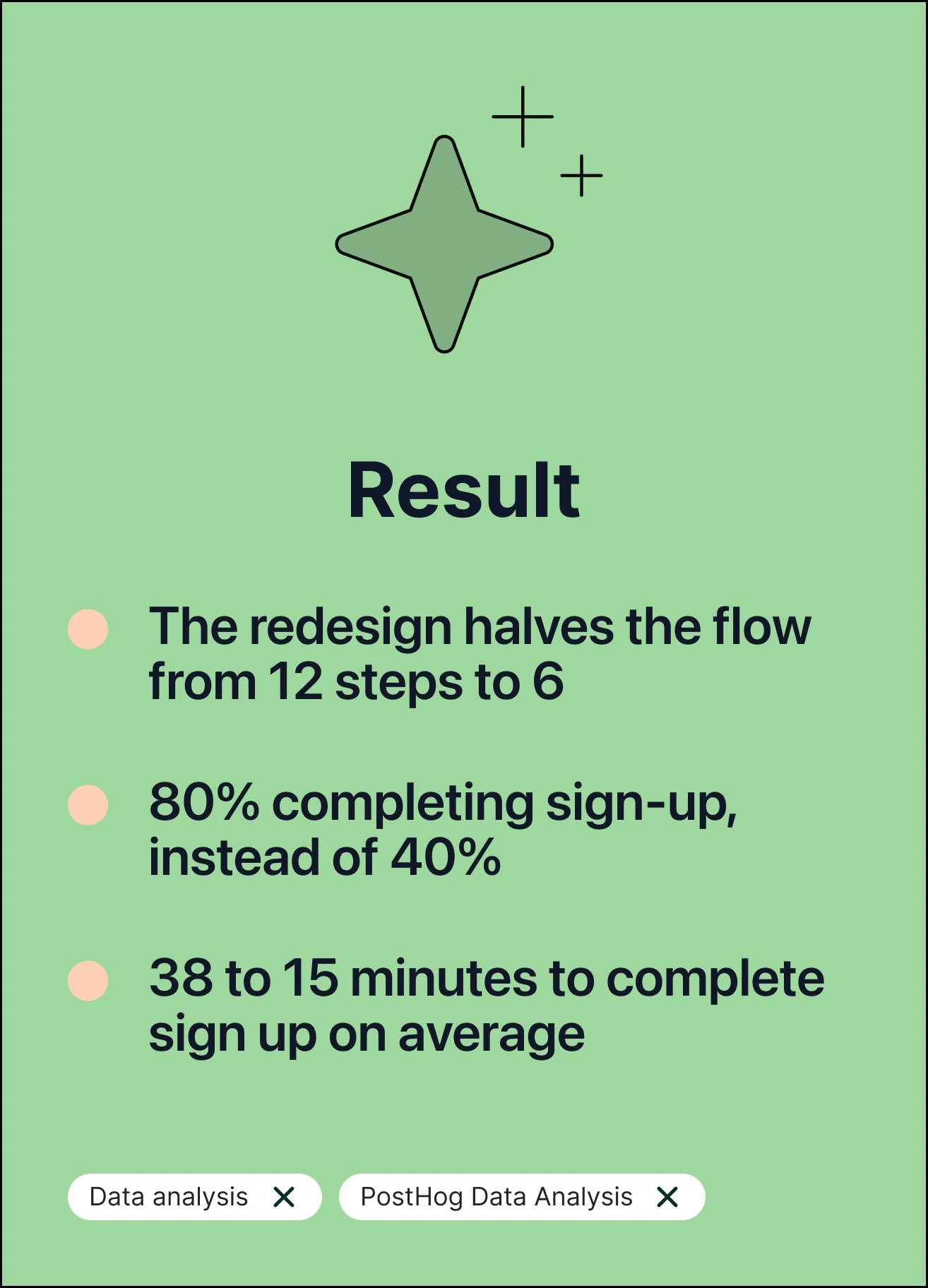
Every decision traces back to a pattern from the interviews and a number from the data. 1. Password moved to step 1 Problem: Password sat at step 10, after identity checks. Decision: Paired with email on the first screen. Why: It matches how people expect sign-up to work, and password managers can autofill straight away. 2. Identity check made visible Problem: People felt lost and worried at steps 5 and 6. Decision: A persistent progress header, a support link that stays on screen, and clear error messages that say what to do next. Why: People stay calmer when they can see where they are and know help is one tap away. 3. Personal details pre-filled Problem: Steps 7 to 9 asked again for details the ID scan had captured. Decision: Pre-filled into one confirmation screen instead of three forms. Why: Confirming is faster than retyping, and it shows the app remembers what people gave it. 4. A clear finish Problem: After 38 minutes, people landed on the dashboard relieved but unsure if they were done. Decision: A full-screen success state adding an onboarding tutorial to confirmed policies, balance, and one suggested next step. Why: Effort should feel rewarded, and the first action on the dashboard should be obvious.
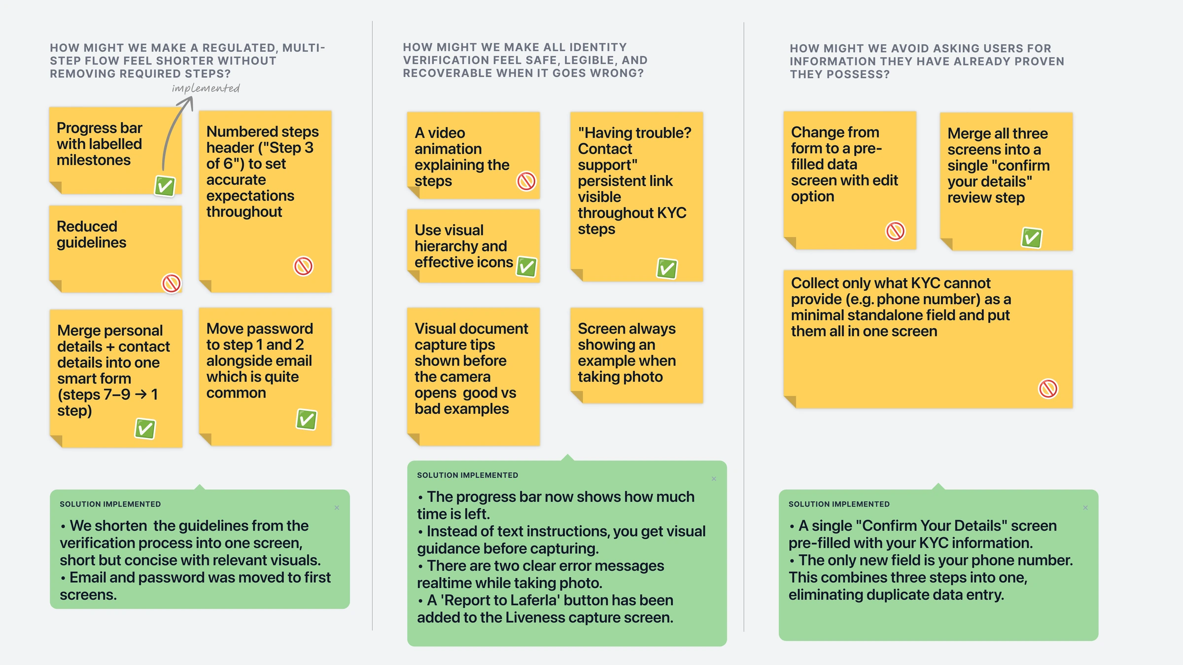
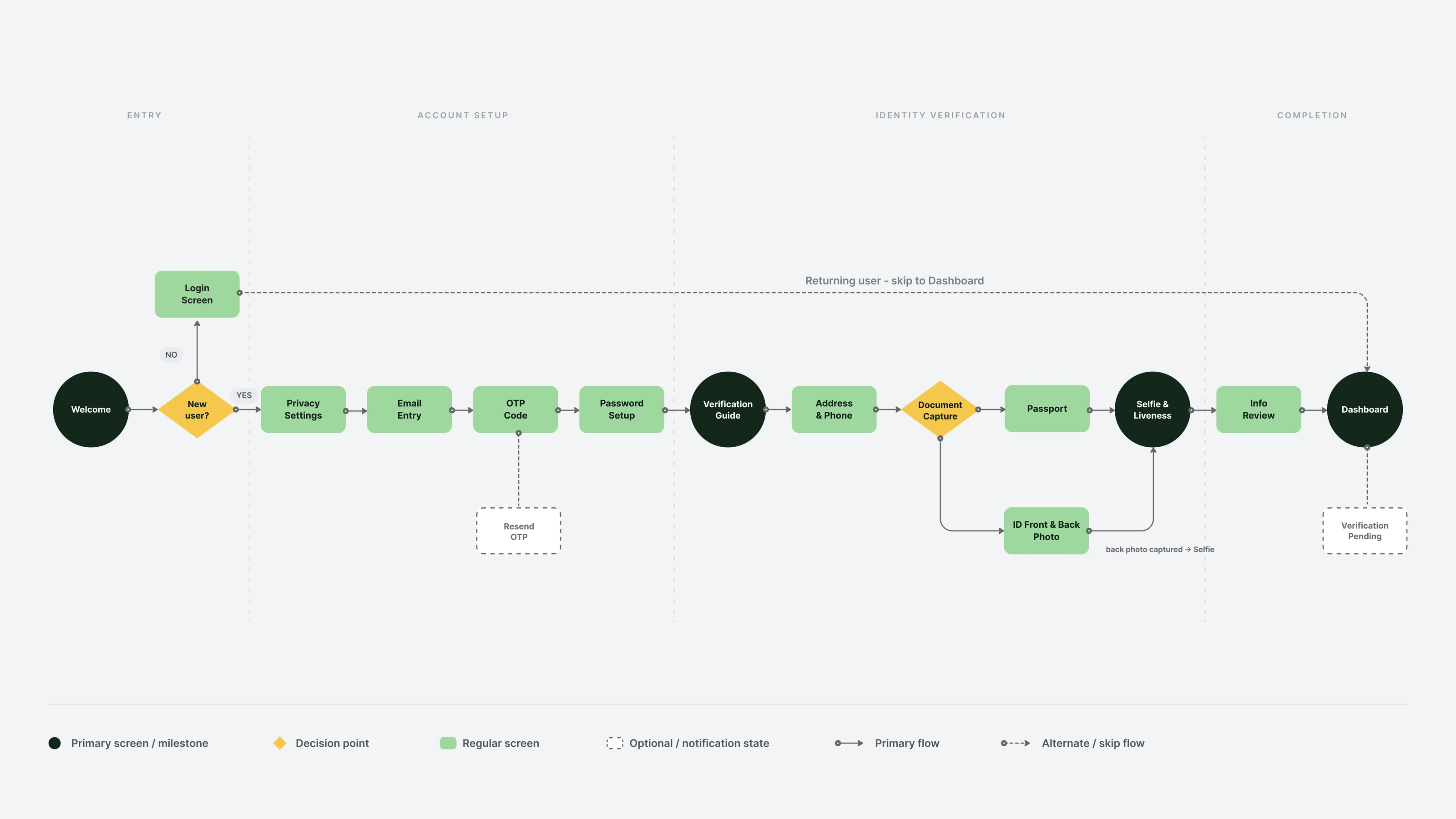
Below is the updated user flow, outlining the journey through a more cohesive sequence of steps.
LOW FIDELITY PROTOTYPE
Before any visual design, wireframes were used to test two things. Does the new order make sense? Does the shorter flow actually feel shorter? What could we simplify?
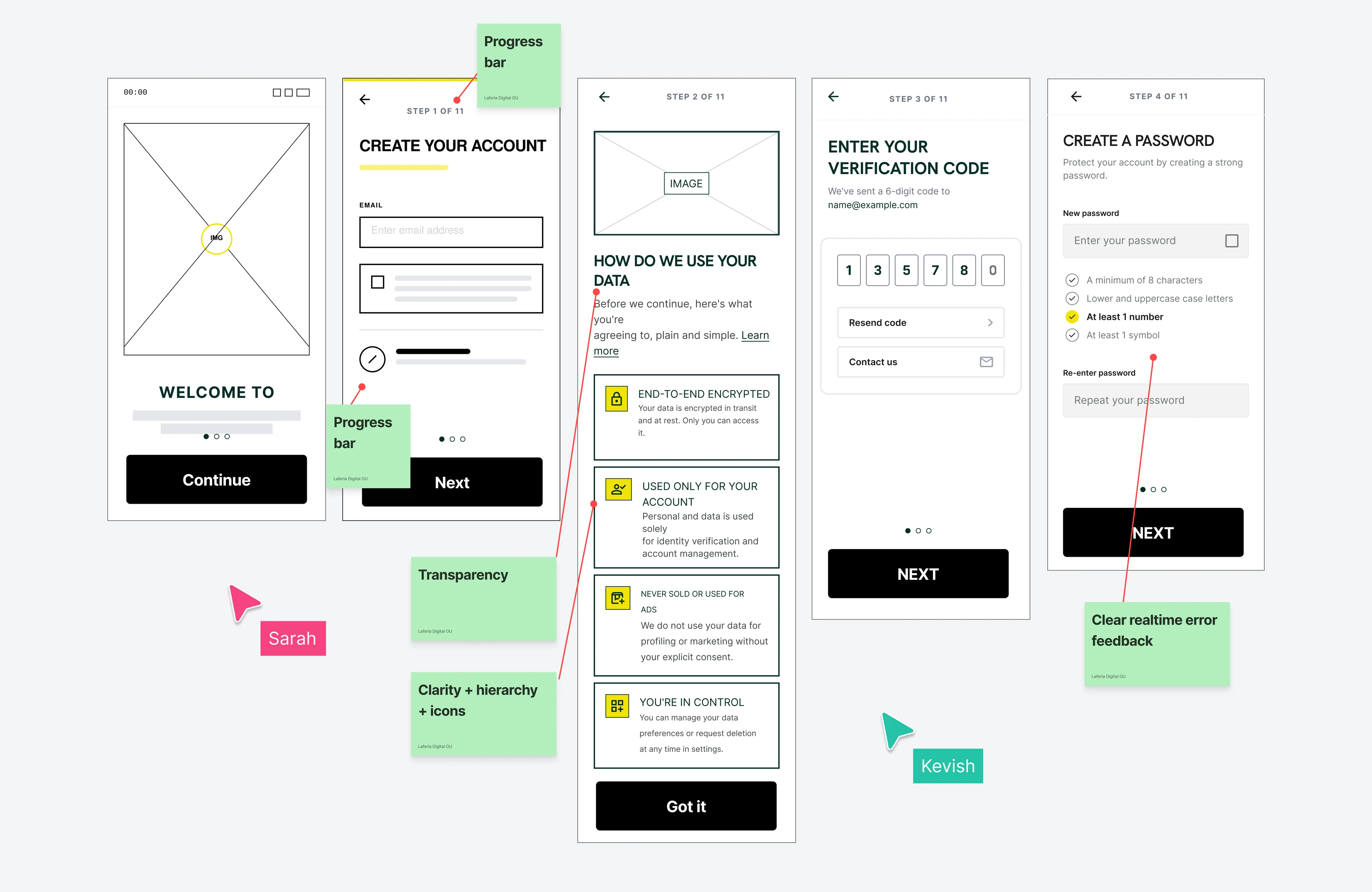
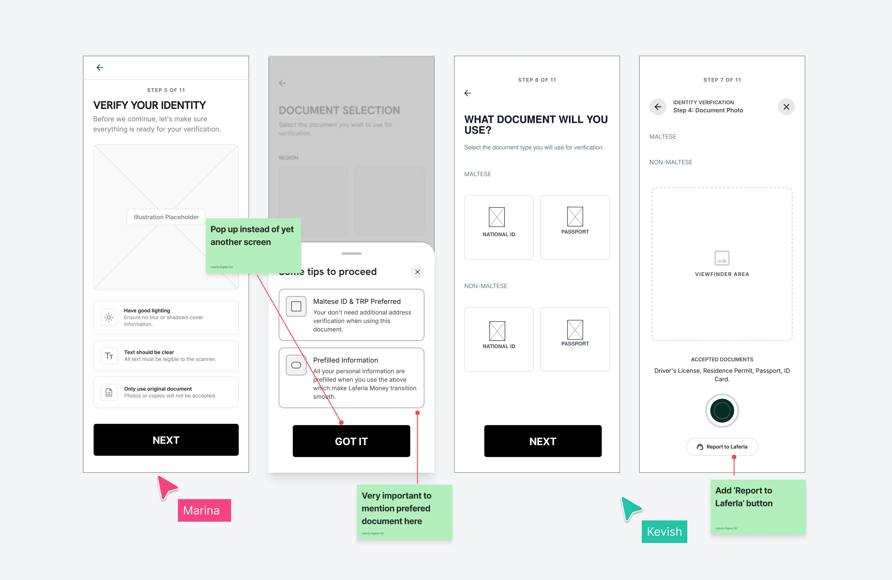
Colour, imagery and branding were left out on purpose, so feedback would land on layout and logic. Design workshops were run throughout the team to brainstorm the best flow and layout. What testing changed: A. The biometric step was moved. B. Pre-filled fields were given a clearer label. C. A “Report to Laferla” button was added to the identity check, so people can get help instead of leaving.
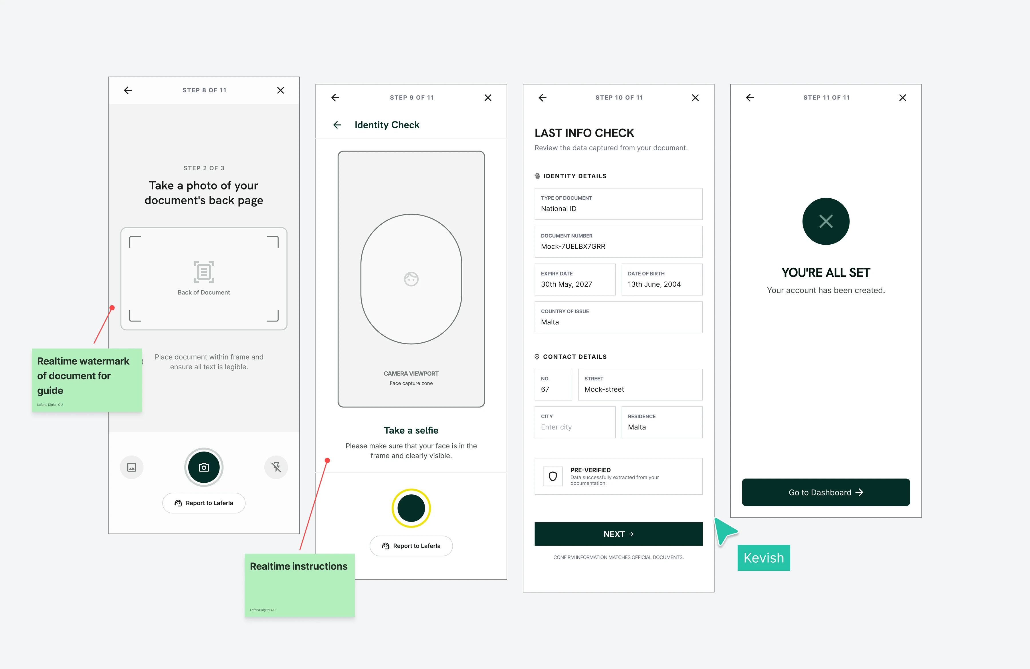
HIGH FIDELITY PROTOTYPE
With the structure validated, the prototype was moved into Laferla’s design system: refreshed visuals, the established type hierarchy, real error states, and the branded completion moment. This version is going into moderated usability testing with 8 participants.
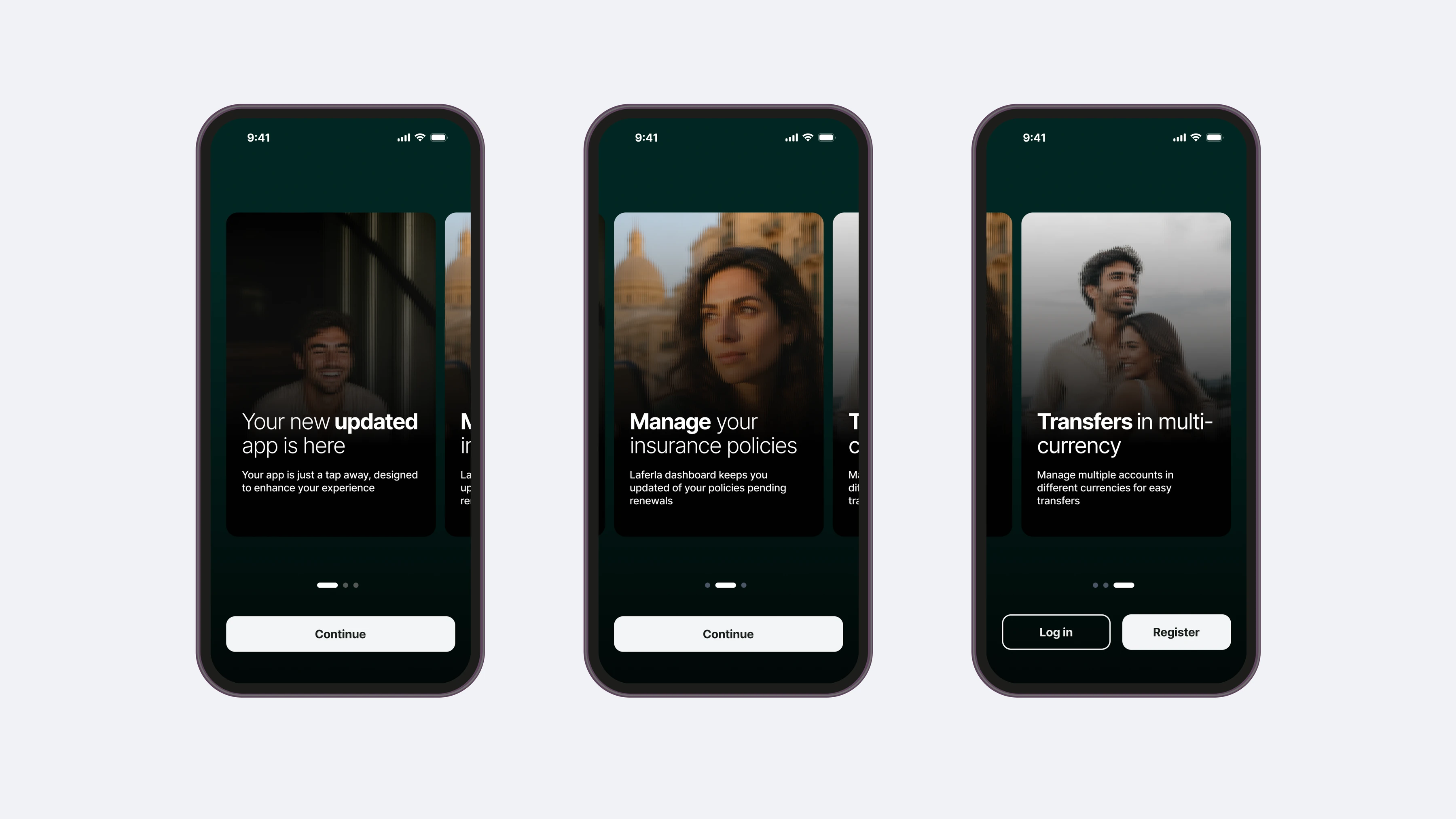
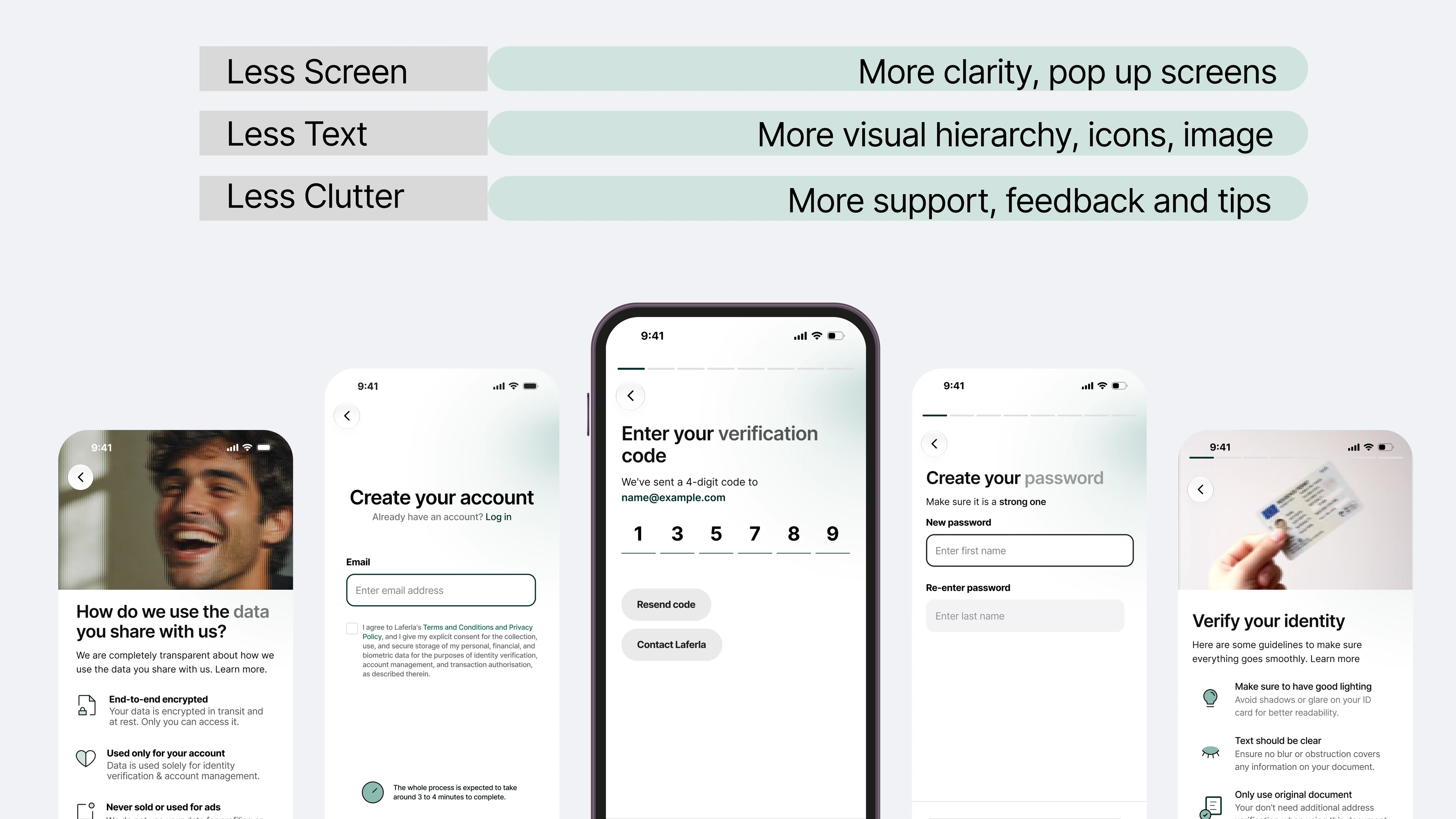
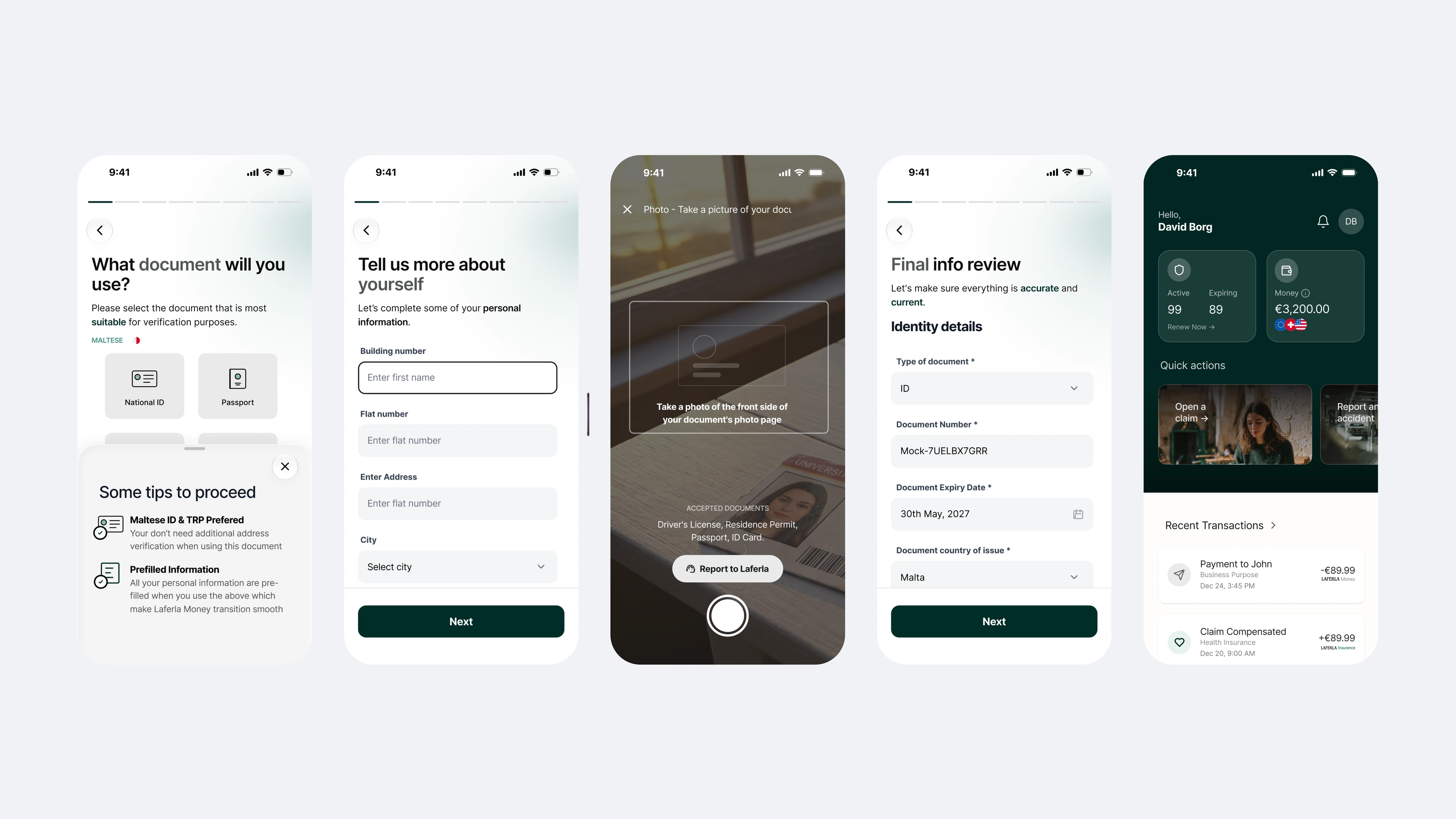
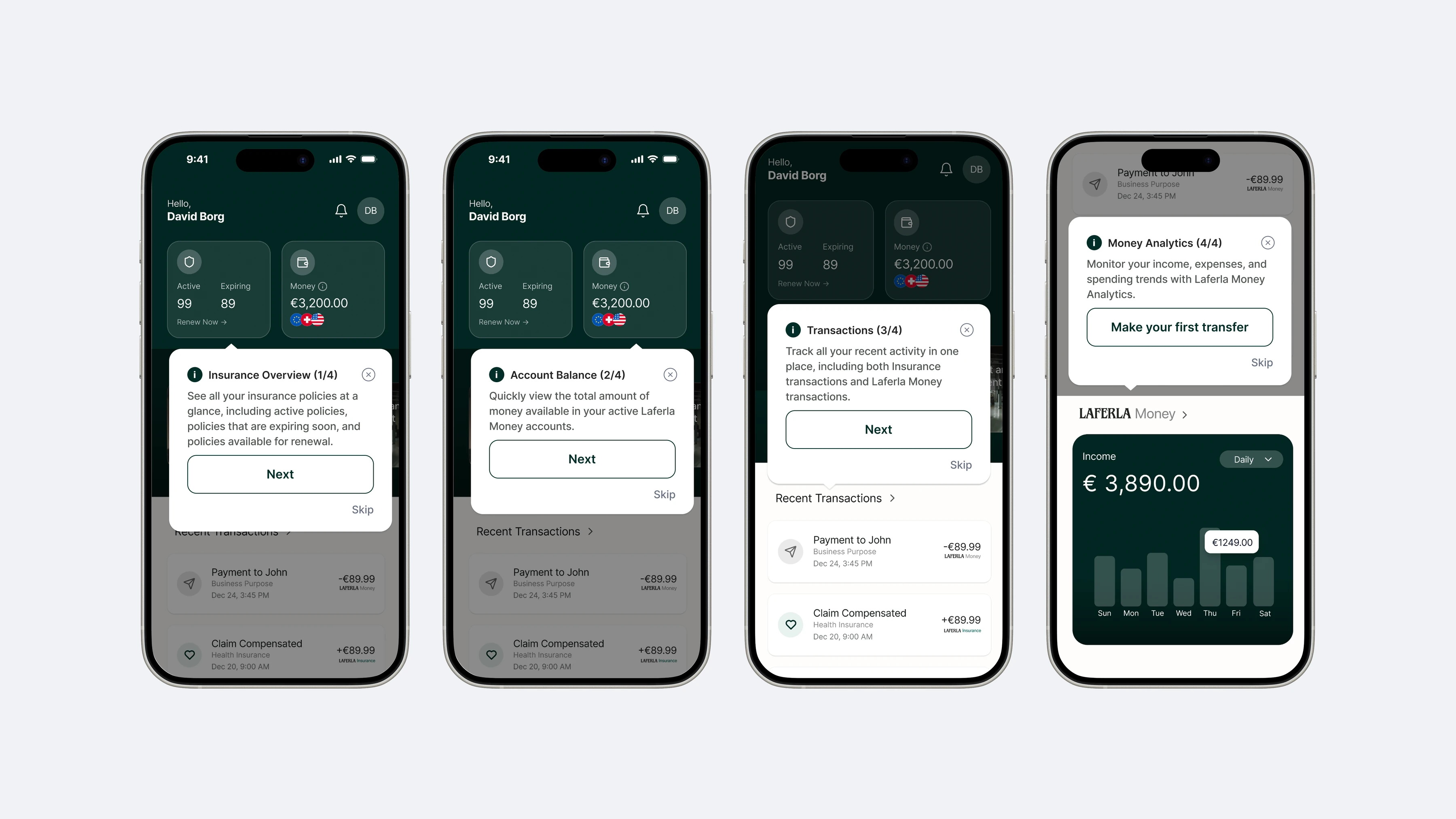
EVALUATION
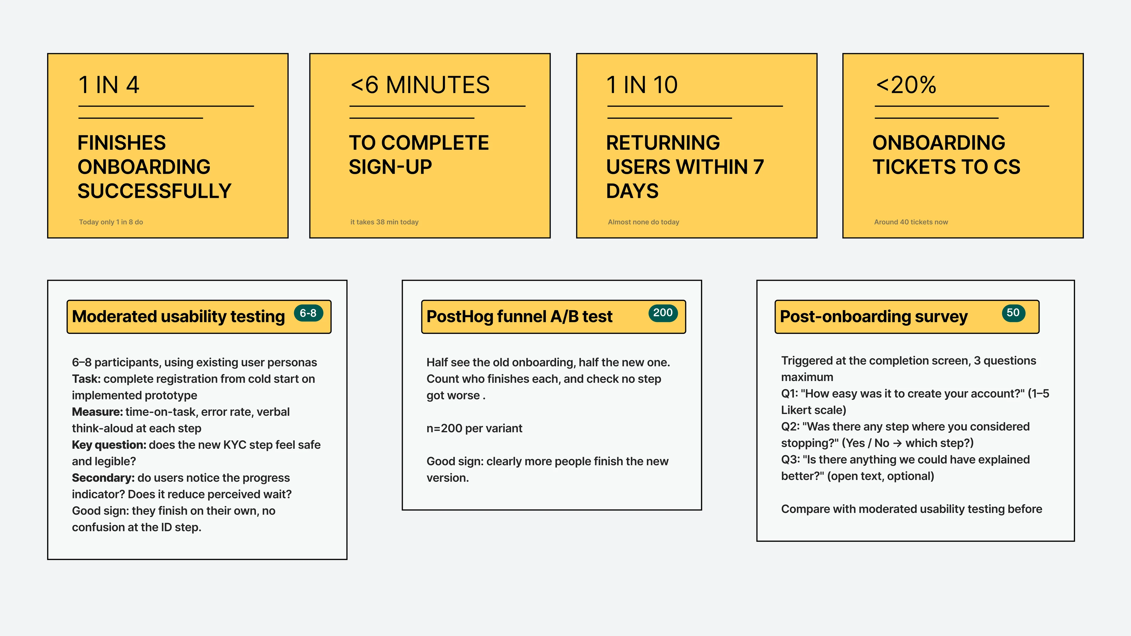
The live flow will be tracked in PostHog, alongside moderated usability testing and two short surveys: one after sign-up, one after drop-off. The redesign only counts as a success if the numbers and the people agree.
DESIGN SYSTEM FOR AI
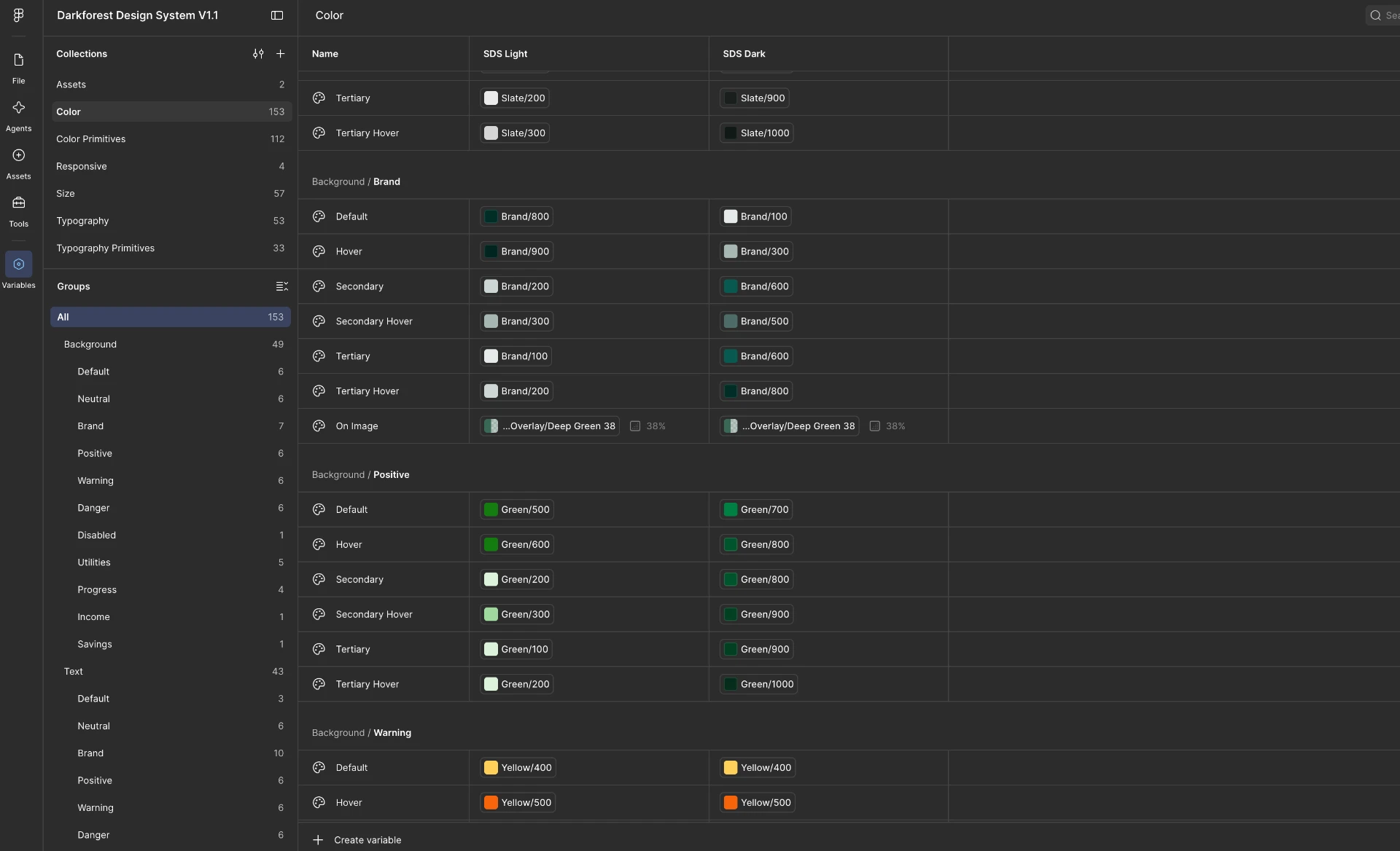
Early on, prototyping speed mattered more than polish. Flows needed testing quickly and consistently, without hand-building every screen. So the design system was also written as a single design.md file: a plain-language description an AI agent could read and build from. It lived in Figma and also as text an agent could follow.
THEMATIC ANALYSIS WITH CLAUDE
Claude was used to support thematic coding across the 12 interview transcripts. Every output was reviewed against the original transcripts before it informed any design decision. Validation of the analysis is still in progress.