Logo design
- My contribution
- Various
- Team
- 2× Product Designer, 1× Product Manager, 3× Engineers
- Year
- 2023
Making STEM competitions stand out in enormous China.
The idea was to make the branding of the STEM competition stand out in the market. The choice of colours would be based on the target audience -students, parents and teachers. However, the main element of the logo would be ‘fun’. Therefore, the core idea is to play around with symbols, icons and colours as long as it looks appealing and significant.
PROBLEM IDENTIFICATION
This project focuses on APASS, a gateway to a wide array of STEM competitions. This project focuses on building the logo design and logo animation.


PRODUCT OVERVIEW
It includes the logotype, the idea behind, the brand identity and the sub product, Expo-Sciences
Logo Animation
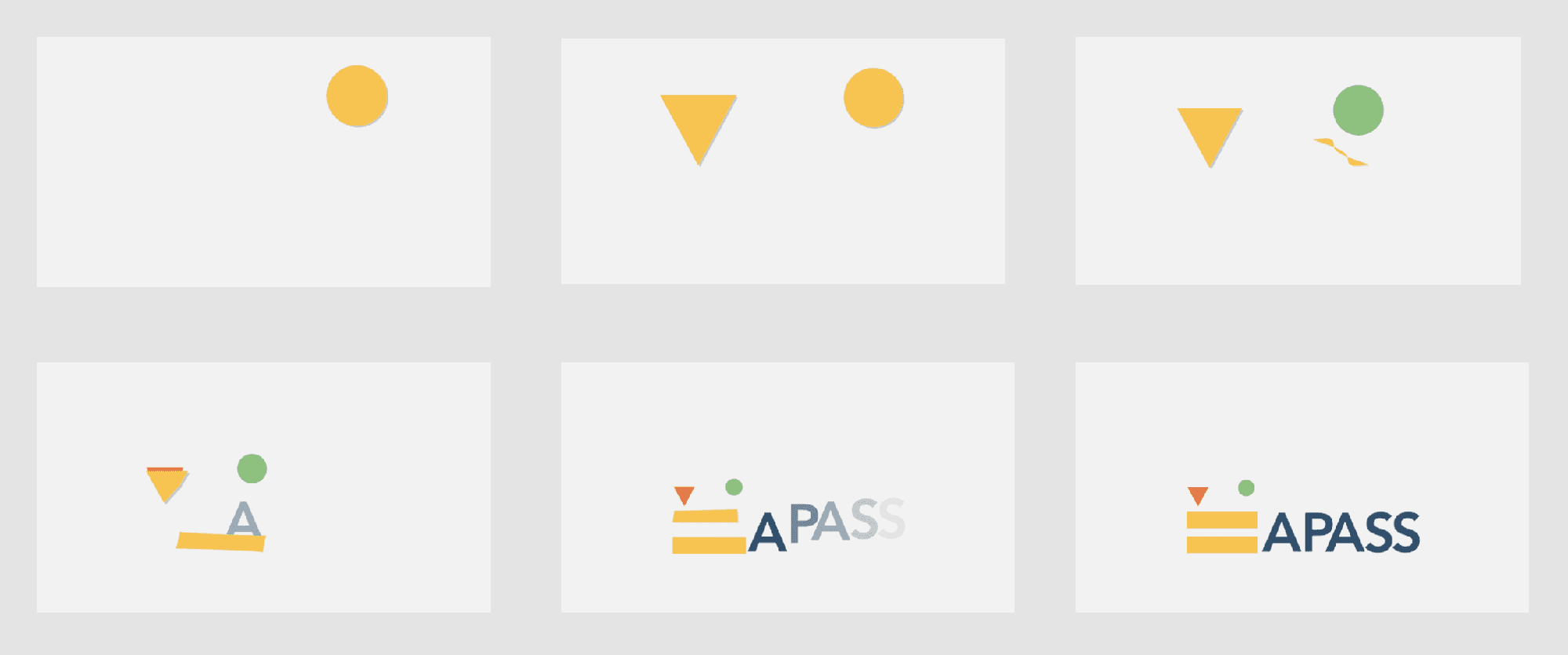
In general, adding motion to a logo brings more brand awareness. The DNA sections aims to demonstrate DNA replication and the maths section transitions from a subtraction to equal sign. It definitely makes it more interactive and engaging in the audience’s mind. Thus, these animation sequences were created mainly for content shared on social media.
Web Banner
The web banner to be used through the website and as cover in different social media platforms. This idea was suggested to show how the whole branding can be projected in brochures, newsletters and any content created to be able to create the intended reaction to distinguish the brand in the customer’s mind.

The final logo

Composition
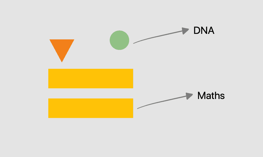
The logotype is inspired on the 2 of the 4 nitrogeneous bases that makes up a DNA to represent the science part of the competitions. Experimenting around with the icons recreates the same idea that makes and develop life. The ‘equal’ symbol represents the mathematics part of the competition.
Colours
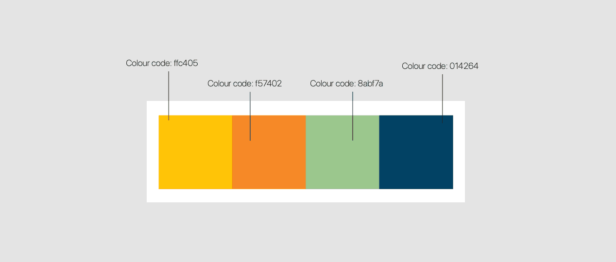
The colours in the whole branding are more bright as the main aim was to pop out and draw people’s attention. The colours used are contrasting , and with visually intersecting set of spatial characteristics, it is bound to attract the audience. The use of yellow as the primary colour signifies the youthful, bold, and energetic spirit behind the competition. The symbols have a lighter shade of orange and green to contrast with the yellow.
Sub Product: Expo Sciences
Main Logo

Subjects