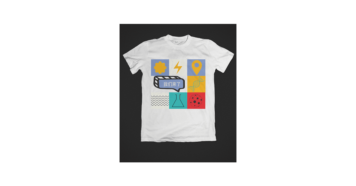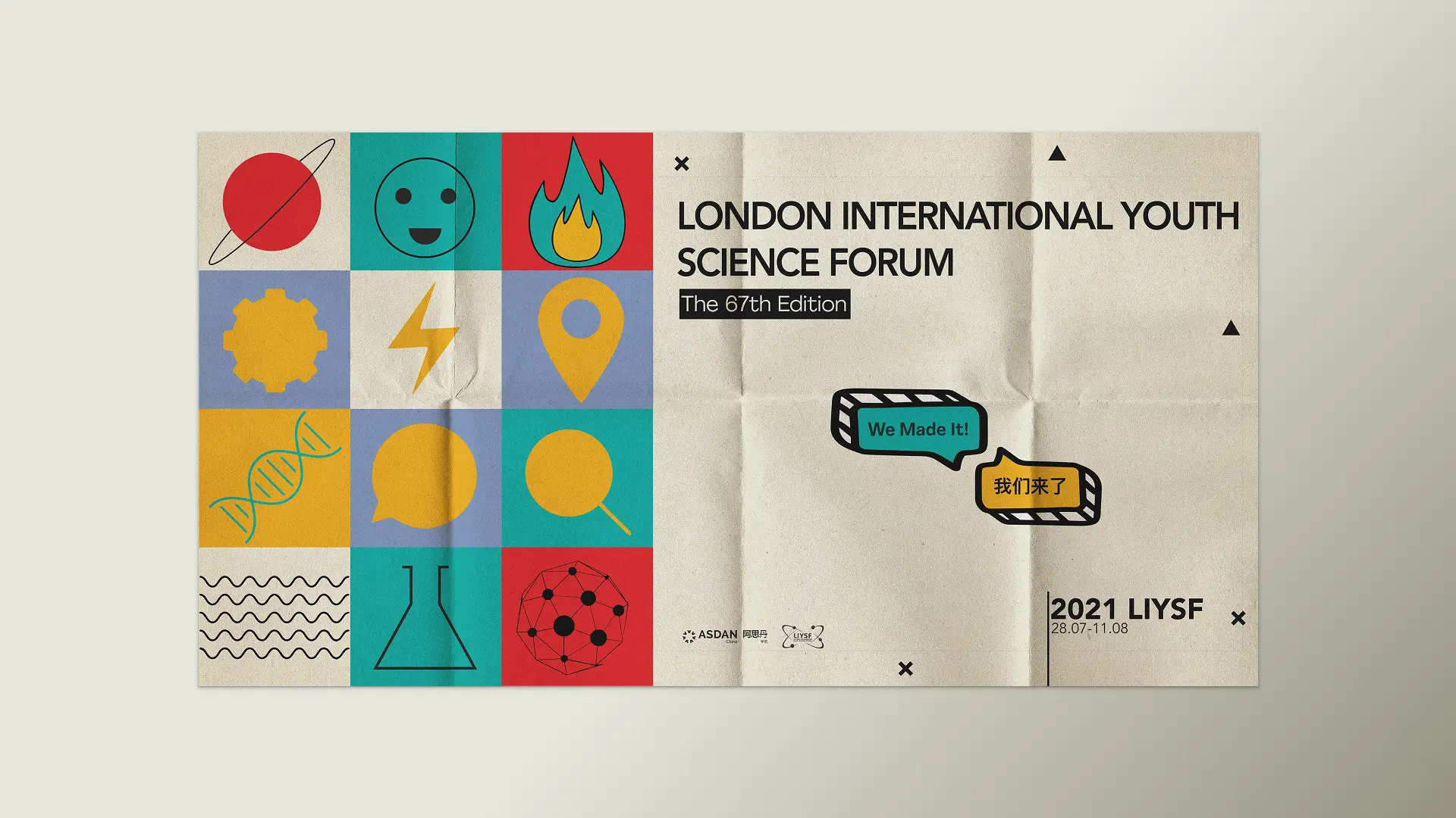
merch and poster
- My contribution
- Various
- Team
- 2× Product Designer, 1× Product Manager, 3× Engineers
- Year
- 2021
Making a science conference feel modern and playful.
The marketing graphic design behind a brand new conference, LIYSF. Therefore, every material should be focused on creating a solid brand that builds loyalty, credibility, and, most importantly, uniqueness, so it stands out from the vast competition that exists and makes it distinctive and memorable for the participants attending. This project focuses on the logo redesign, posters and event banner
PROBLEM IDENTIFICATION
48% of event attendees find in-person interactions with brands more valuable than 2 years ago. Live experiences, conferences, workshops, tradeshows, and more, help connect brands to their audiences in ways that other marketing channels cannot. However, with the heavy competition and the myriad of flagrant promotional materials in China, it is hard to stand out with subtlety. Since this event is mostly geared to school students, it is essential not to be abstract and find more suitable ways to explain complex ideas in simpler ways.


PRODUCT OVERVIEW
The London International Youth Science Forum (LIYSF) offers a summer school programme both online and in-person held, at Imperial College London & The Royal Geographical Society in the UK. The programme expanded to China, and this conference is meant to be replicated simultaneously to facilitate access despite travel restrictions due to COVID-19.
IDEATION
Every step of the way is carefully constructed and considered to ensure it captures the authentic feel and emotion of the conference. Particularly the symbols that make up most of the materials explain the conference's whole concept. It is playful and colourful yet interactive.
ELEMENTS
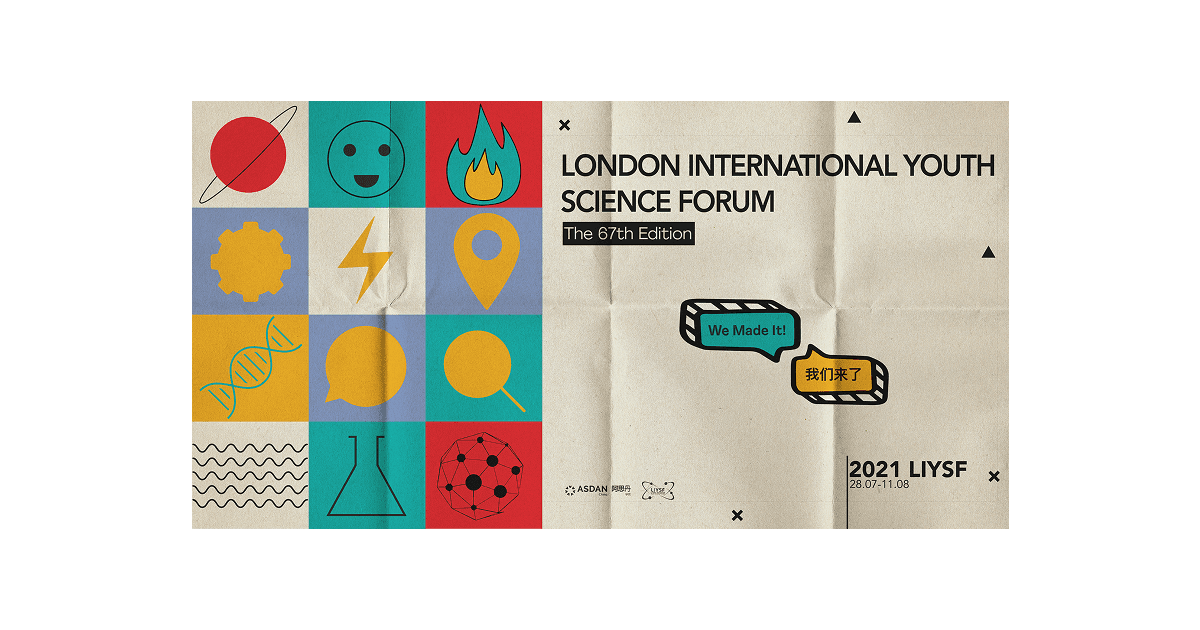
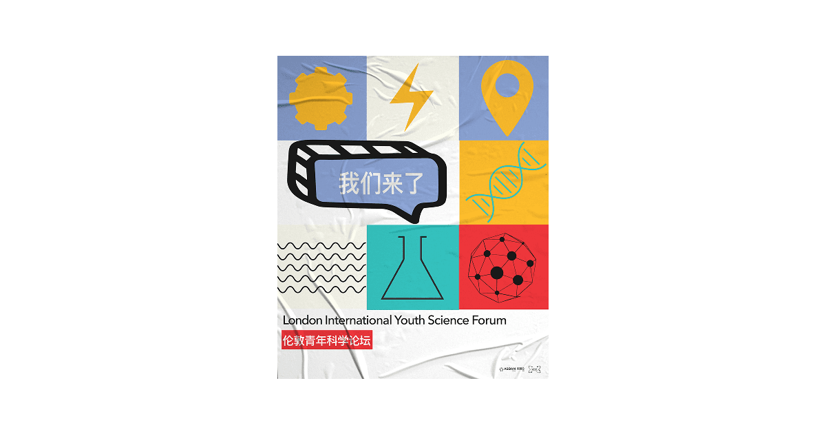
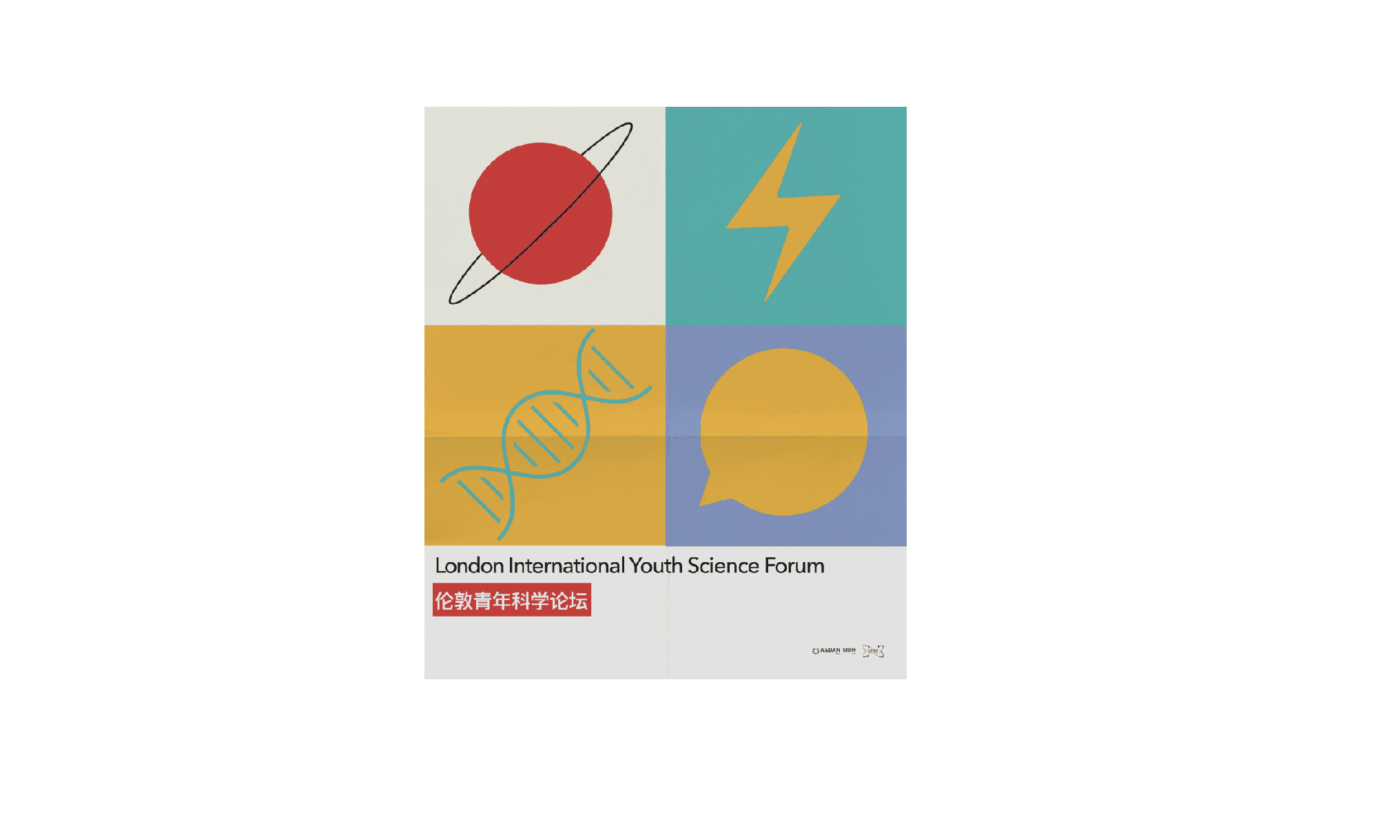
A symbol or icon is one of the most commonly used graphic content in the modern age. It helps to communicate experience by providing recognisable meaning that we share throughout the world. In the design context, the symbols should be as minimal as possible, with just enough details to express the message that we intend to communicate with the audience. In various instances, if the symbols are too complex, it can be not very clear, thus defying the purpose. A symbol helps to tell a story without the use of words. As represented in the banner and posters, each symbol tells the story of each characteristic of the conference.
Explore
This image of a planet serves the biggest purpose of communicating ‘Explore’ since this is the first idea we get when we think of the universe

Technology | Innovation
This image of a wheel universally communicates technology- which fits the content of what the product has to offer. However with techonology comes a lot of innovation and curiosity which I aimed to bring to the overall feeling of the artwork.

Experiment
Science means a lot of experimenting to prove our hypothesis. However if we go down the memory lane, a lot of experiments in our labs in elemenetary school was under a bunsen burner, which explains the purpose of this ‘fire’ symbol.
Energy
Traditionally this symbol has been used to signify lightning and also electricity, Electricity, as being part of science, in this context it signifies the energy. The active and energetic atmosphere that the event brings through a series of activities.

Network
This image of several dots connected to each other which try to communicate the ‘networking’ aspect of the conference.
Waves
Wavy lines = Waves = Physics
CHOICE OF COLOURS
The first consideration behind the choice of these colours is the target audience which was elementary and high school students. Since this event was new, I had the freedom to develop my own set of colours. The palette is a mix of pastel and vivid colours. It shows a mix of modern colours yet is energetic and upbeat. Harmonious and yet professional - if well used throughout the materials. The red brings excitement while always optimism. The idea behind these colours tends to induce positive feelings. The pastel purple, being soft and subtle, tends to really stand out in print. Traditionally these colours have been neglected but tend to bring vitality and freshness to design.

THE BANNER
THE POSTER
THE MERCH