SHORT FILM AND MOTION DESIGN
- My contribution
- Click on the title above
- Team
- 2× Product Designer, 1× Product Manager, 3× Engineers
- Year
- 2020
Introducing a conference theme with short film and motion.
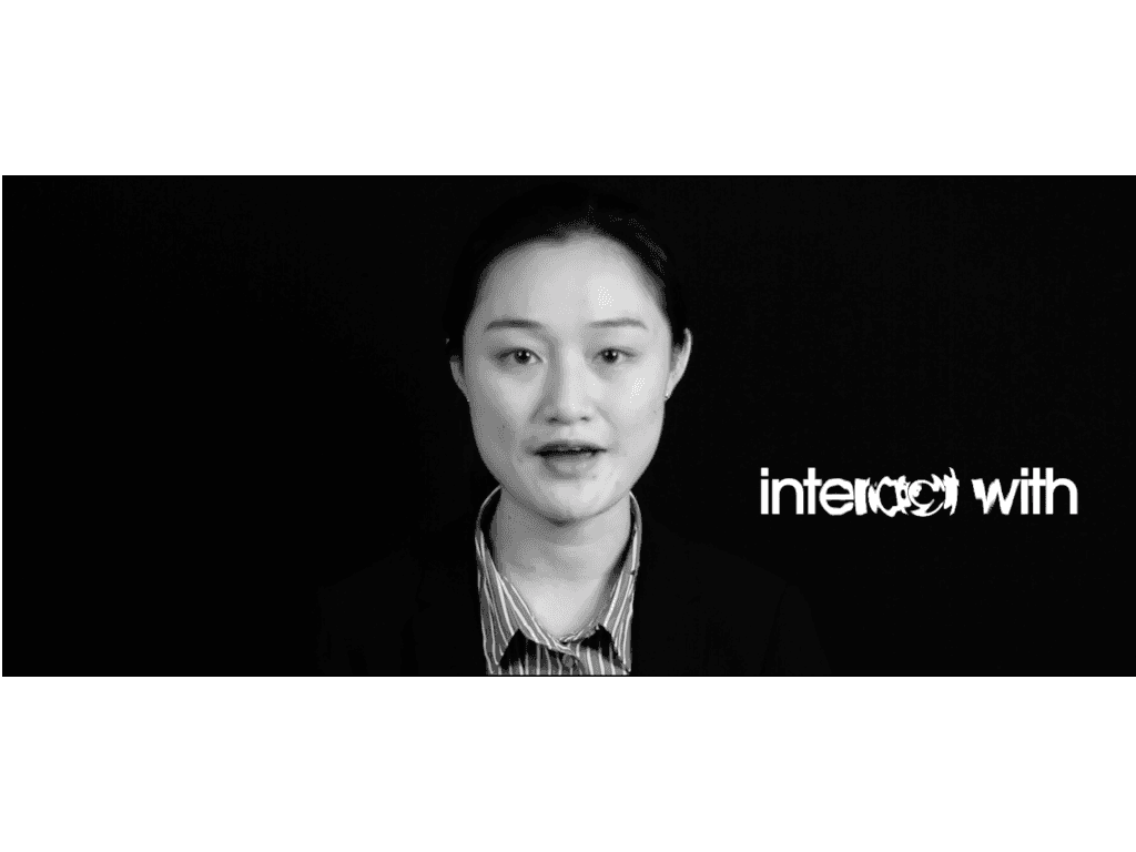
The goal here was to create an yet another engaging opening video for the World Youth Economic Forum. Together with people explaining the theme, the video uses motion (kinetic typography) to explain the words they are saying - in this way, the audience can understand more clearly the idea being communicated, and at the same time, this increases the interaction with the video In this video, different motion effect is used to make the font come alive. It is meant to convey and evoke an idea or emotion. Besides being informative, it is also eye-catching and exciting - making the audience engage thus retain the content more easily. It also helps keep the audience more focused on the content as they await what comes next in the overall animation. Another important thing about these types of animation is not to overdo it because this will in turn lead to oversaturation which will get them bored more easily. The aim here was to create simple yet elegant animation to catch the audience attention right off the bat.
1. The Theme
The whole idea behind this video was the explain the idea behind Networking. Traveling to different countries, cities, volunteering, or working, the word Networking has always held a lot of value to me. This forum target high school student from age 15 to 21 years old, therefore I wanted to make this video as simple as possible to explain the meaning of the theme of the event. As the production evolved, I realized that I could enhance the understanding and make it more intuitive through the use of typography and appropriate animation
Additionally, in this video, I tried to include as many people as possible because this is what people connect to - People connect and relate to people more than anything els
2. Workflow
Scriptwriting → storyboarding → research | moodboading → video shooting → typography → video editing
The technical setup for this video was quite simple: it involved a black backdrop and a couple of LED lights. With the rising of Tiktok and other such user-generated platforms, there have been many cheap lights appropriate for vlogging. Besides being cheap, they are also very powerful to the extent of imitating a strength of an expensive key light. They are light and portable which was handy since I had to move to different cities to film the 'interviewees'.
Most of the post-production was done using Adobe Premiere Pro, and the typography animation was done through Adobe After Effects. There is a fluidity to AE that Premiere Pro does not have. I believe that these small details are essential to catch the user's attention within the first few seconds of watching the video.
3. Considerations
The considerations in the making of the video.
Black backdrop
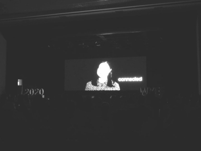
I chose a black backdrop so the characters stand out when this video is being projected in the conference venue with the lights turned off.

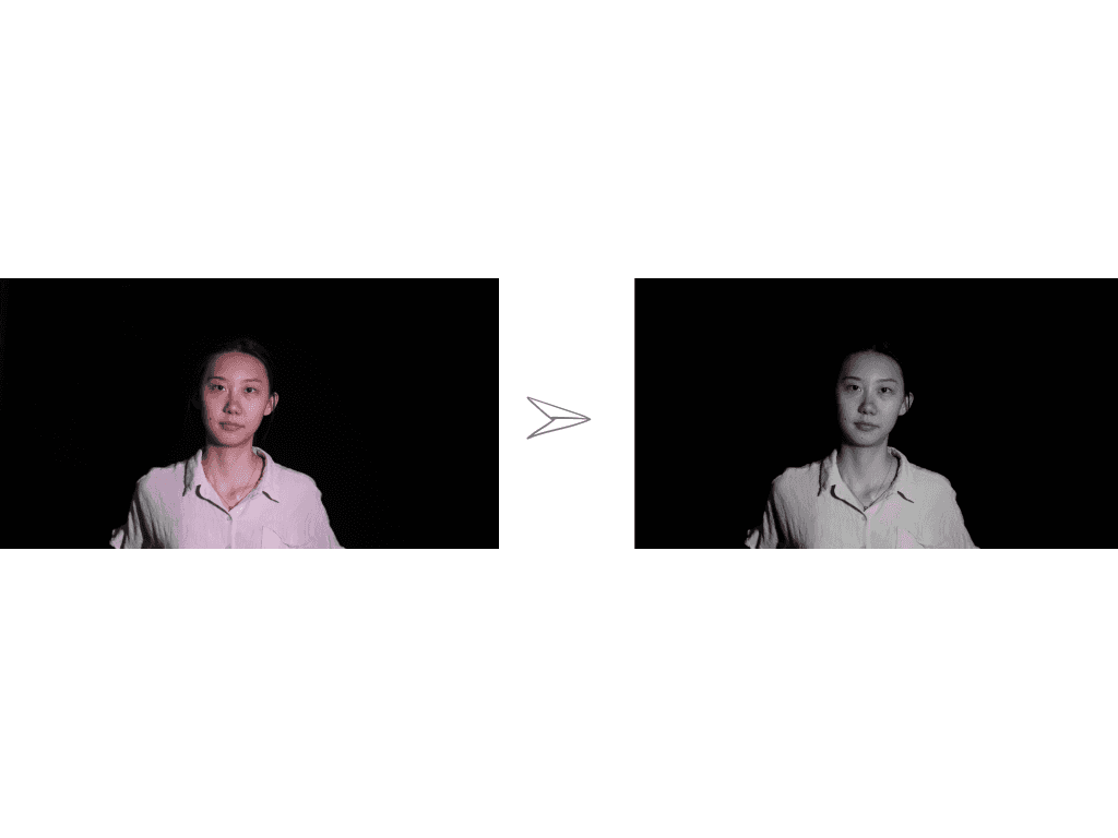
B/W
I decided to change the actors’ part to black and white so that the whole video is less distracting especially since the scenes change really fast. I felt it took longer to grasp the audiovisual content when these scenes were in colour as compared to when in b/w.
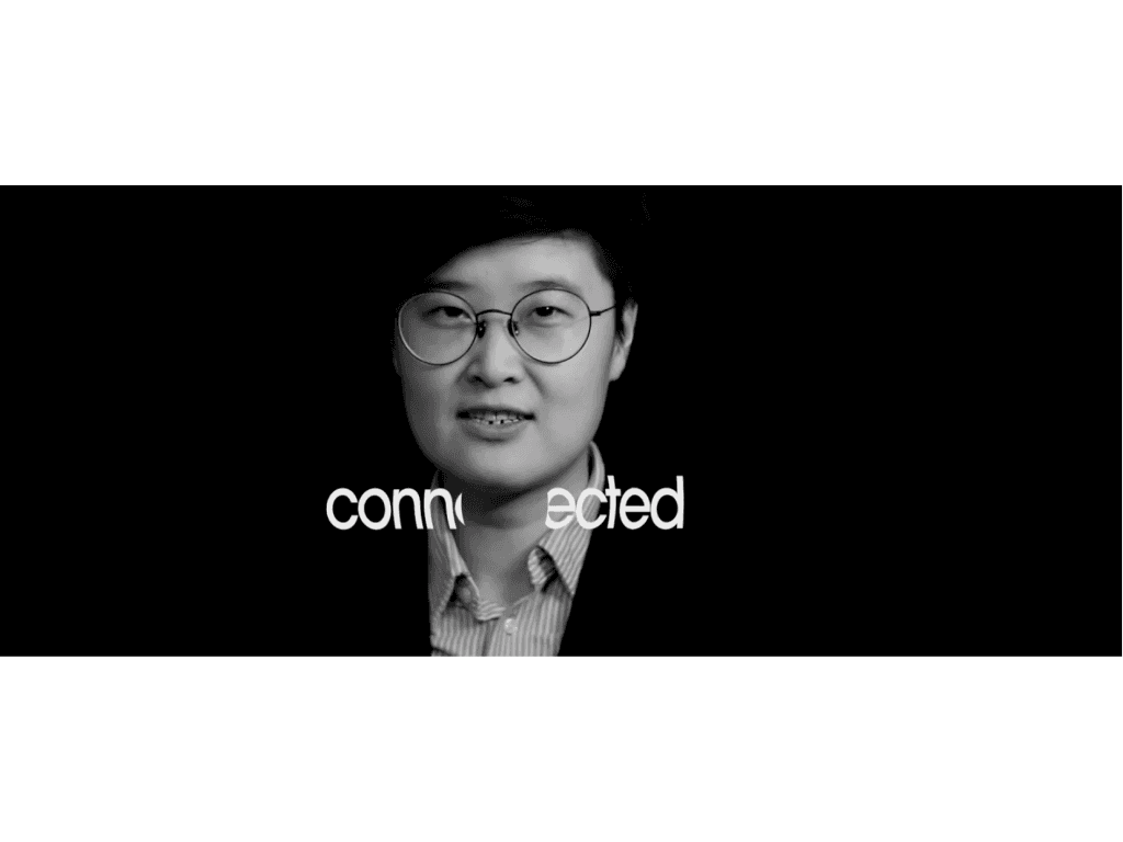
Connected
The word ‘connected’ is the most recurring word in the clip because I wanted it to be the word the audience can remember at the end of the video. The animation aims to visually describe the definition of the word ‘connected’. I divided the word and as the actor says the word, the word connects with a ‘boom’ sound to make the whole experience stimulating.
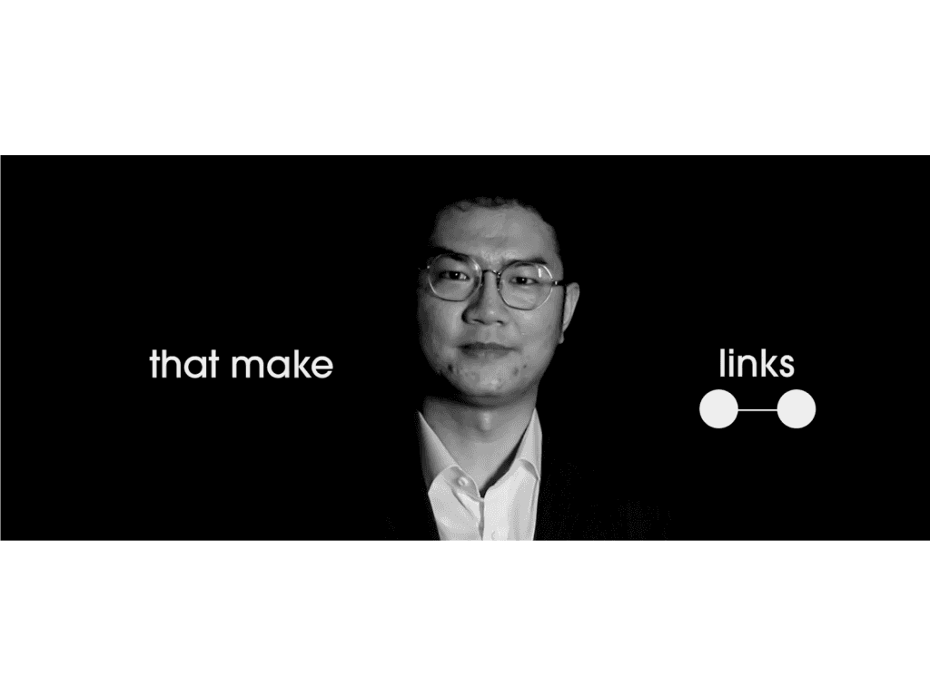
Link
The animation for link: a quick illustration of 2 dots and then ultimately connecting with each other with lines.
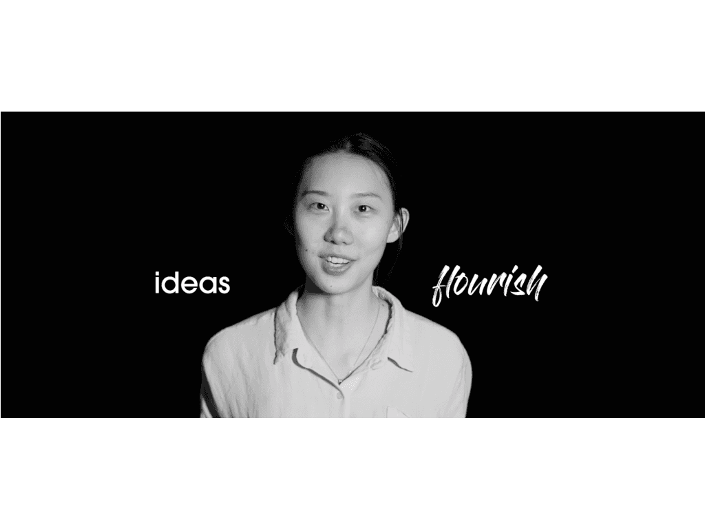
Flourish
For the word, flourish, I decided to experiment by changing the font entirely that was consistant throughout the video, I changed it a handwritten font and added a handwritting animation.
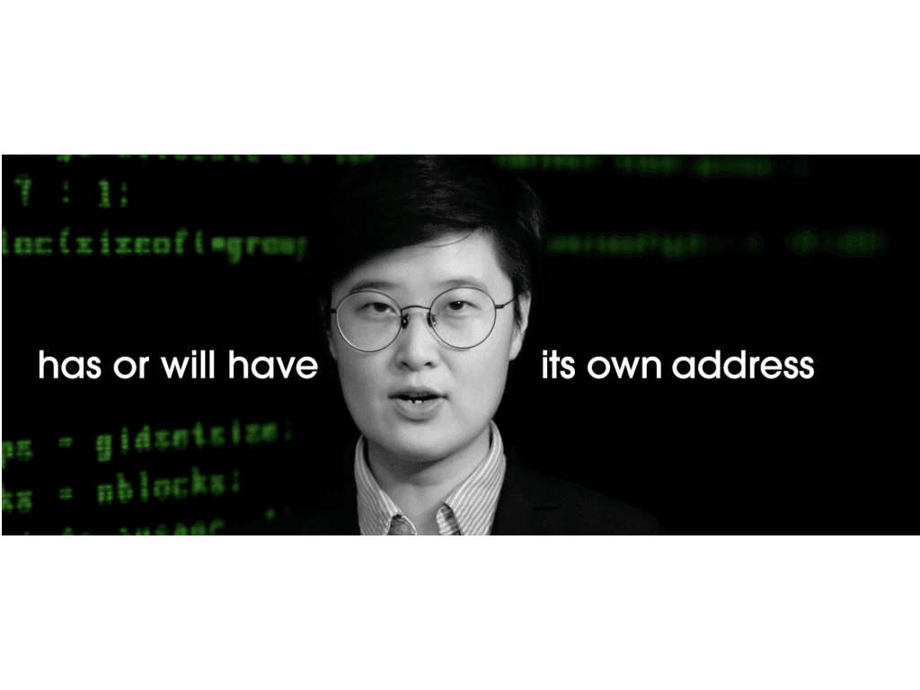
Address
Usually, when people think of the words address, they think of a physical postal address. However through this video I wanted to challenge this and make them think of something related to netwok. This is why when this sentence appears a ‘dial tone’ plays and a series of computer commands appear in the background in an attempt to make the audience think beyond the normal definition of address.
Interact
The ripple effect for the word ‘interact’ attempts to recreate the experience when you touch a surface of water which cause a ripple effect. There are also a lot of mobile devices that causes this effect when touched. The aim here was to make the audience understand the word ‘interact’ within the second they see it.